Managers are able to post their staffing needs directly on the platform, find available employees around them matching with their criterias and make their employees available.
My role
I started at Andjaro as a designer and front office developer. For a long time, I splitted my time between design (web & mobile applications) and front-end development of the web application.
I was then full-time on the design during the rework of the applications.
Finally, I worked on both UX and UI design for the web and mobile application while starting to develop the design system.
From the beginning until now, I was the only designer and therefore led the entire design vision.
Context
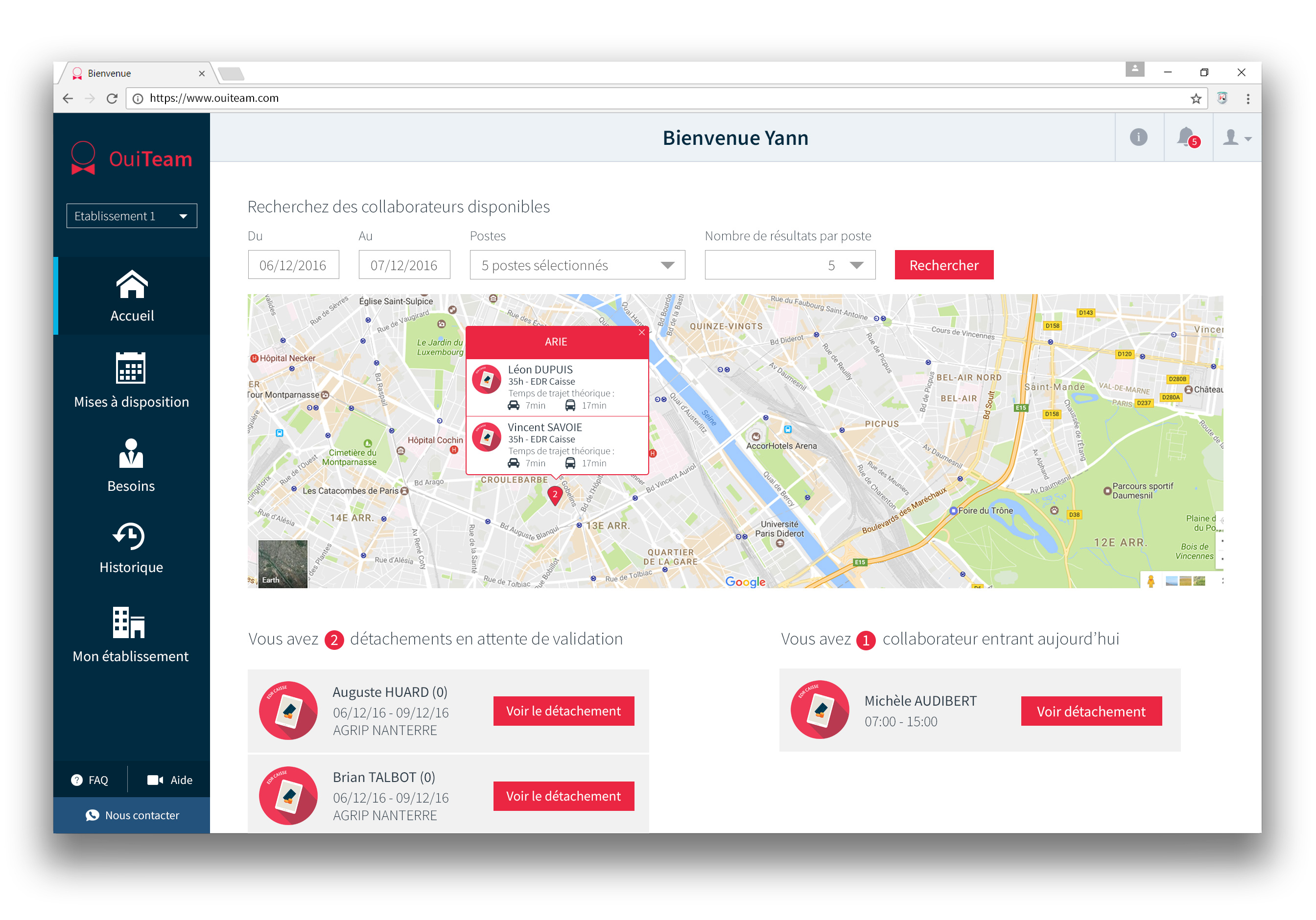
Andjaro was previously known as OuiTeam.
A first web application had been developed and was already used by clients. But it had been thought for developers and not for end users. A first mobile application was under development.
2017
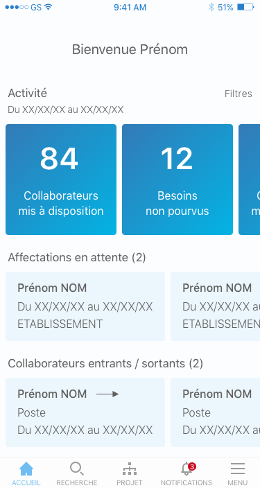
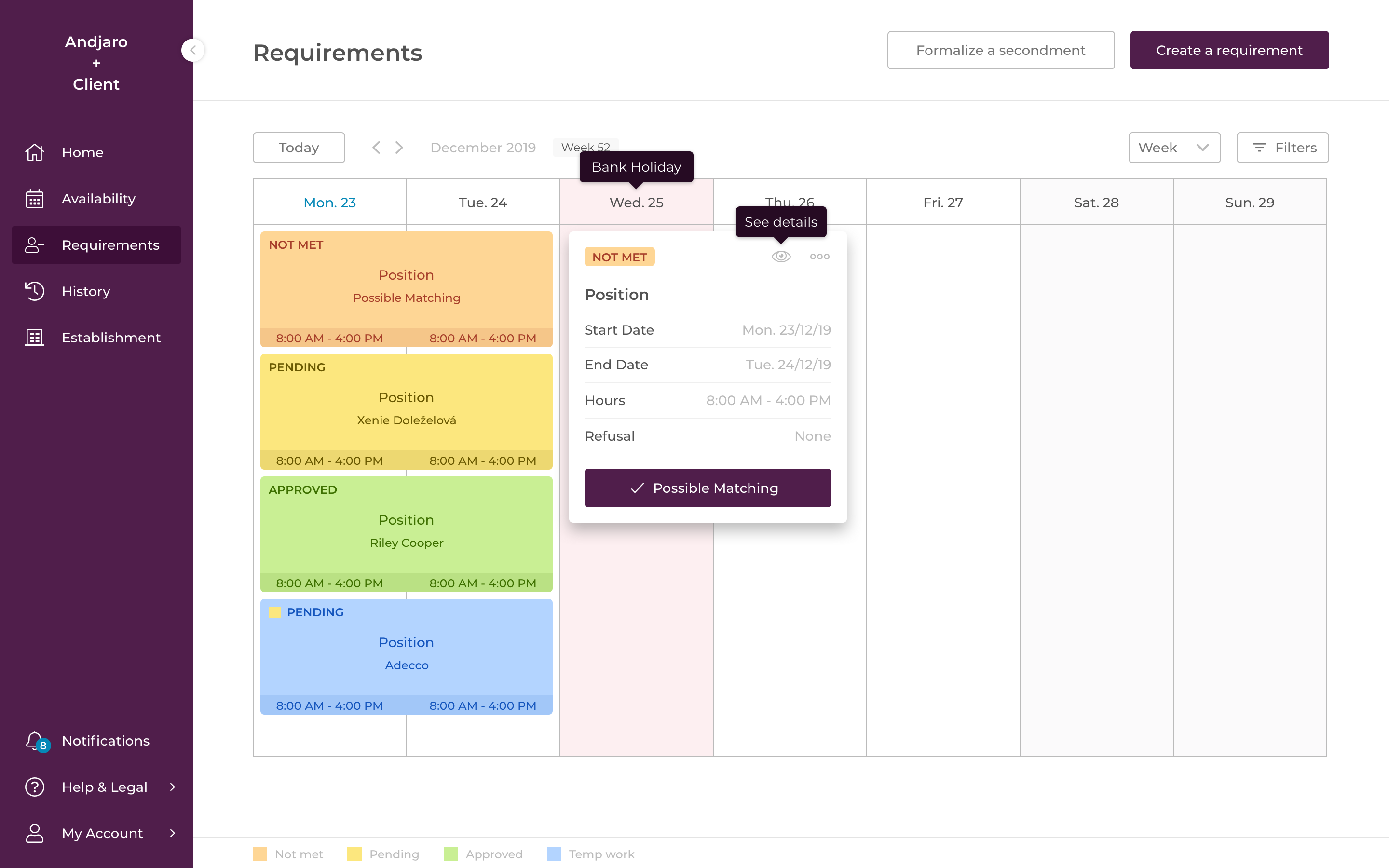
The main goal of this first version was to structure the different pages so that they all had a precise function, that the navigation was the same everywhere, that users could find what they wanted...
We decided to have a left bar for the navigation, a top bar with breadcrumb to always remember where we came from. OuiTeam's primary color was red, it was a little bit difficult to use because it's usually a color made for errors, mistakes...
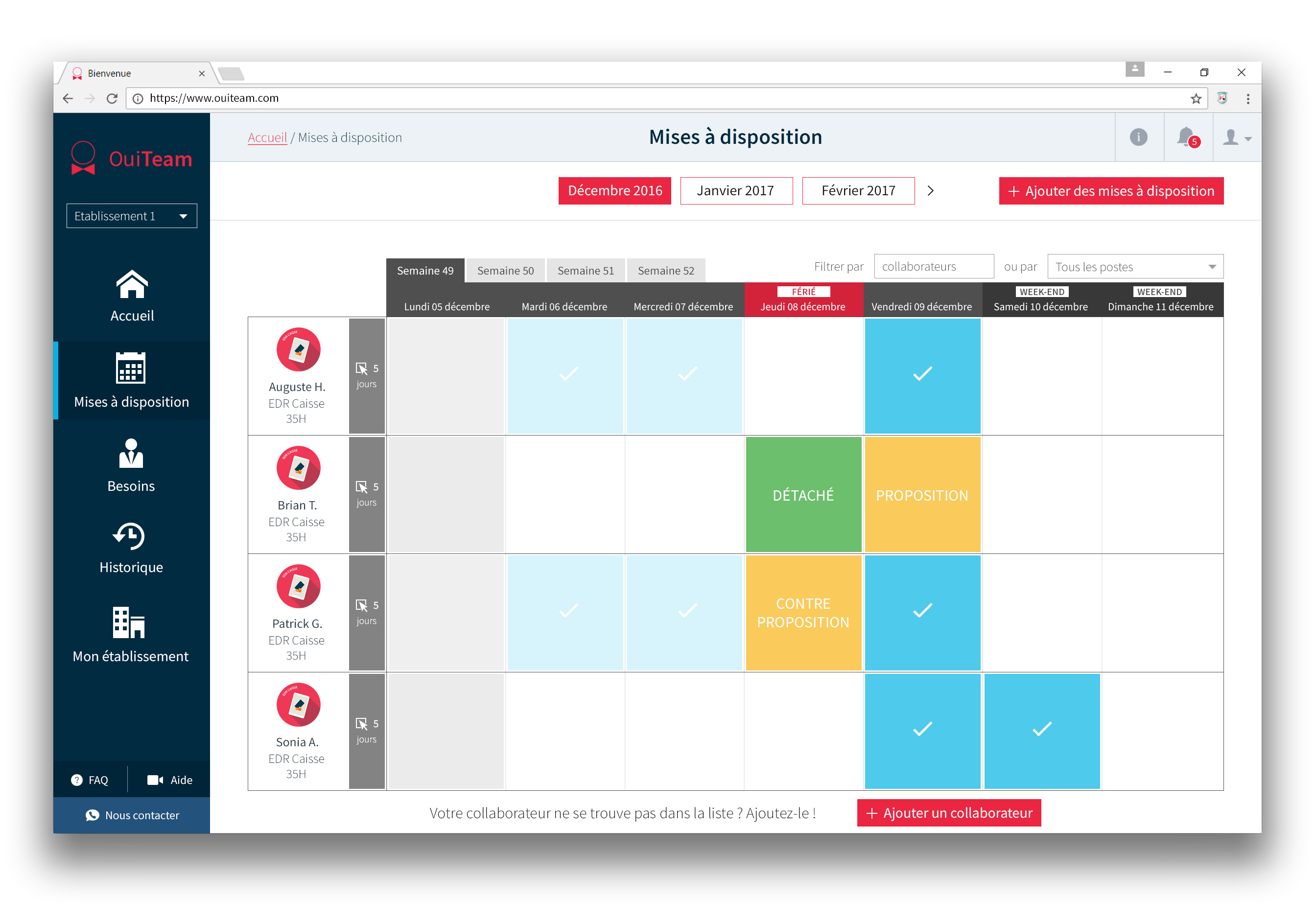
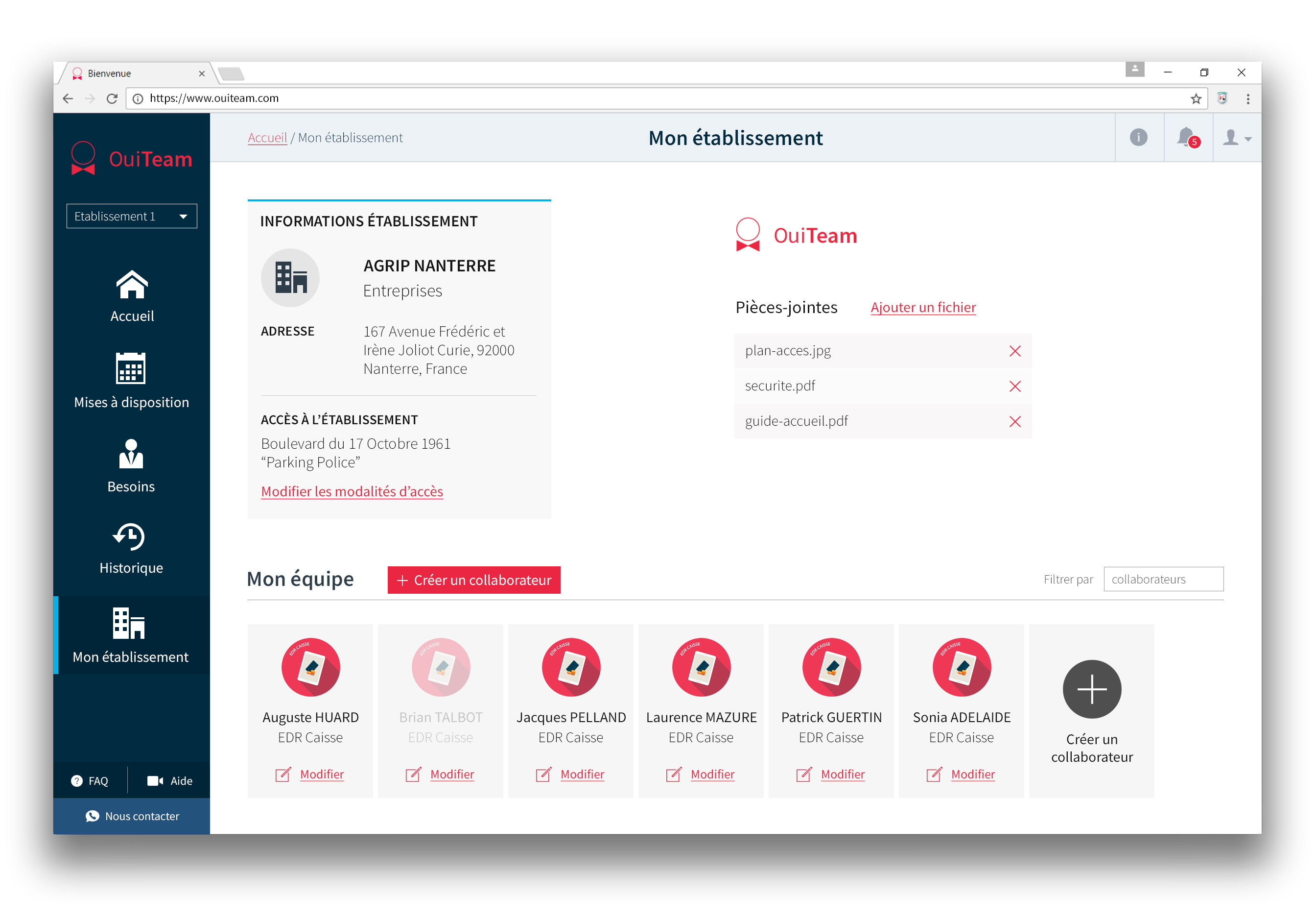
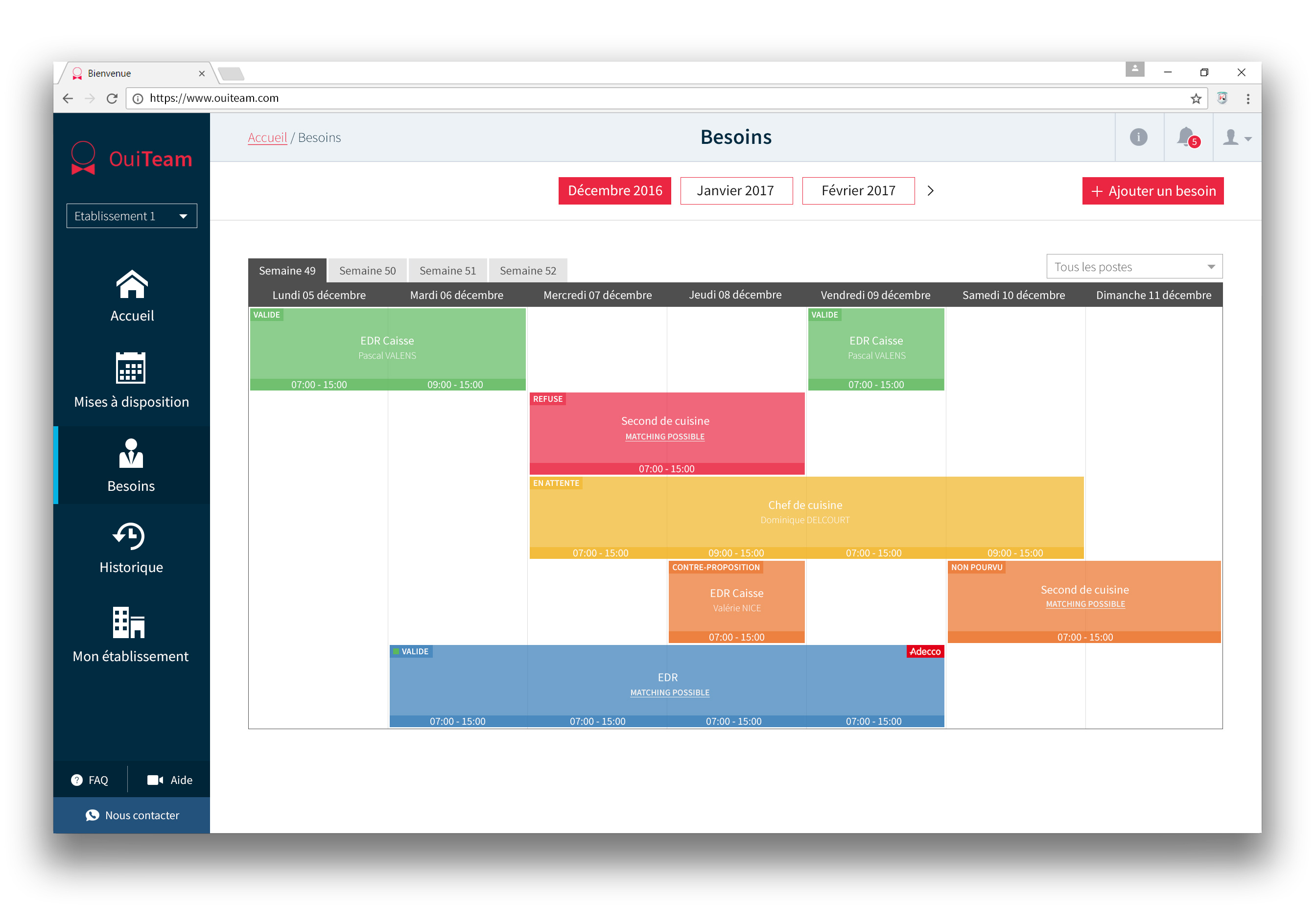
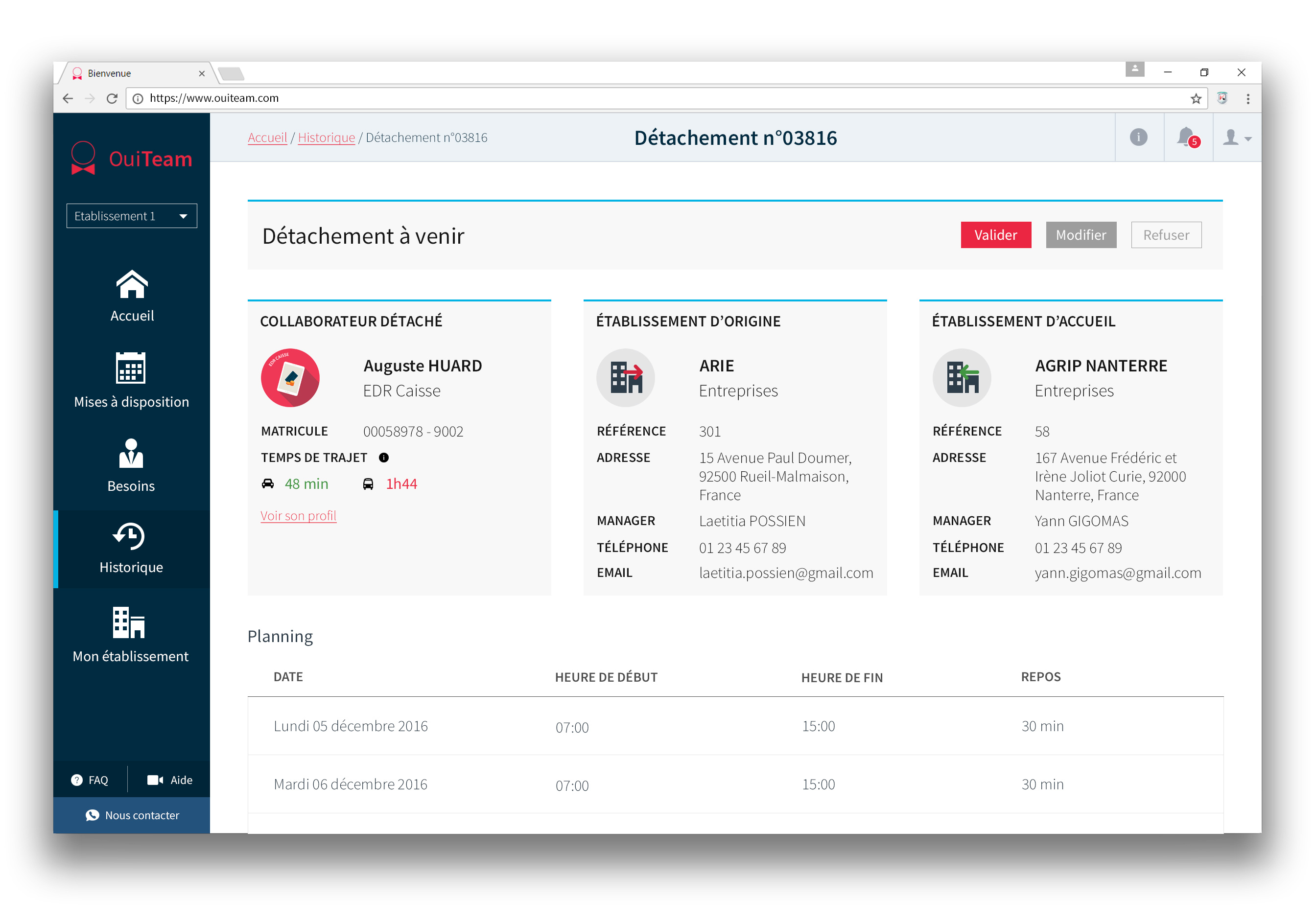
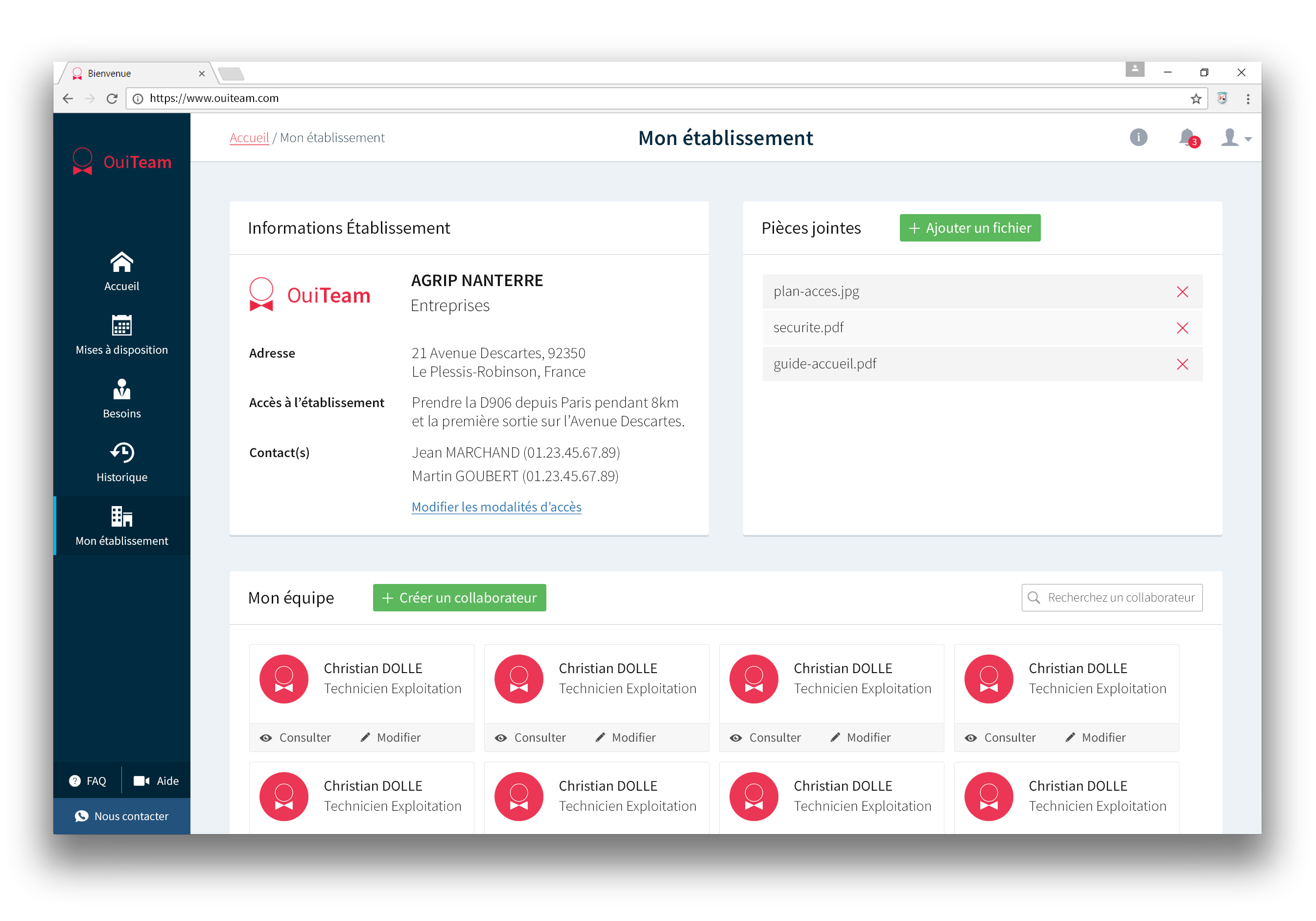
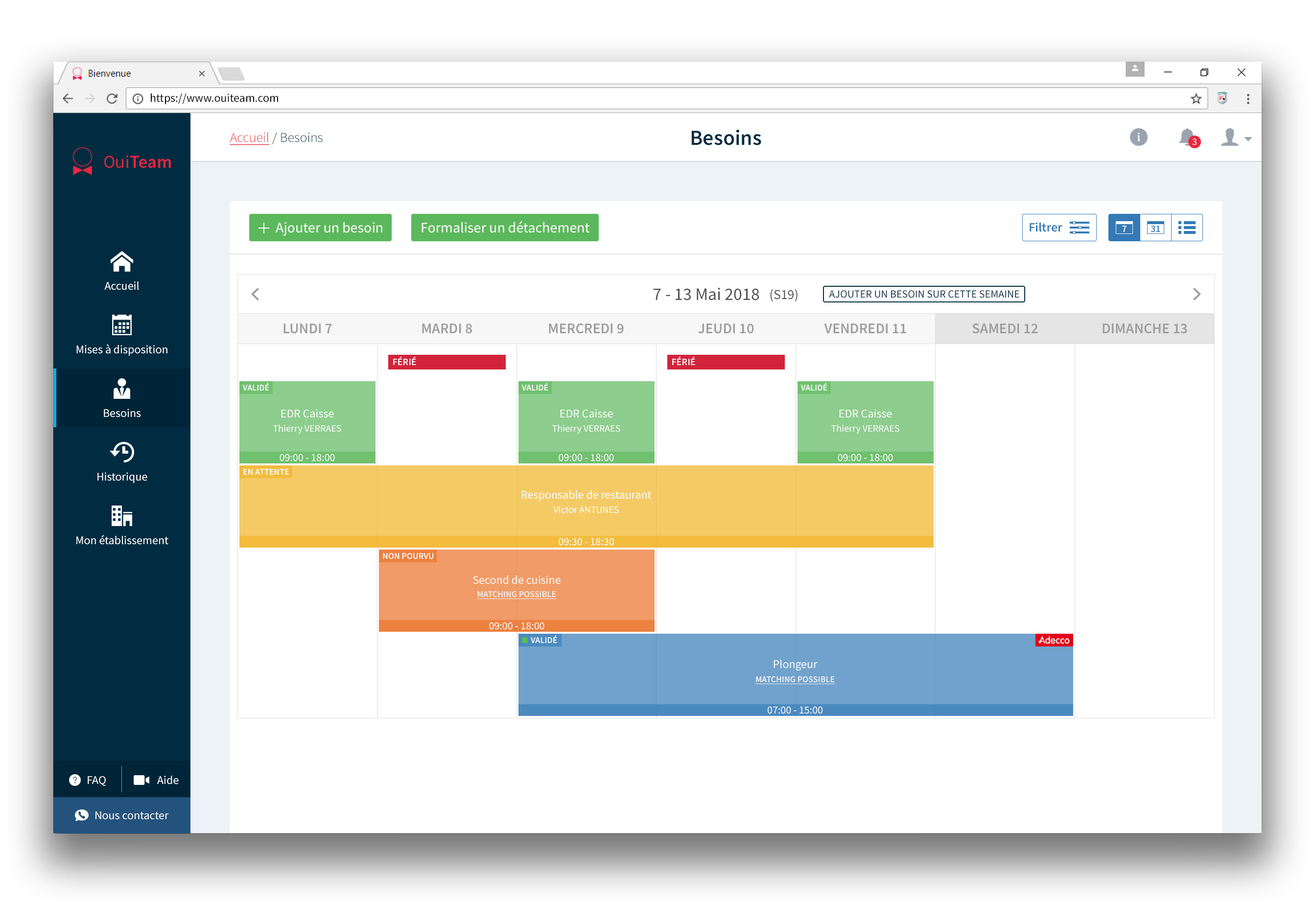
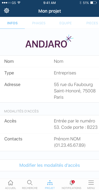
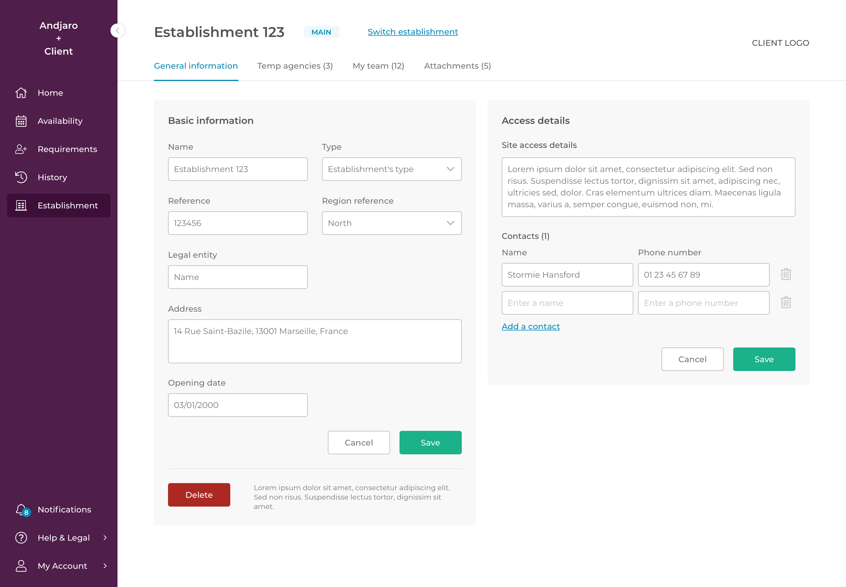
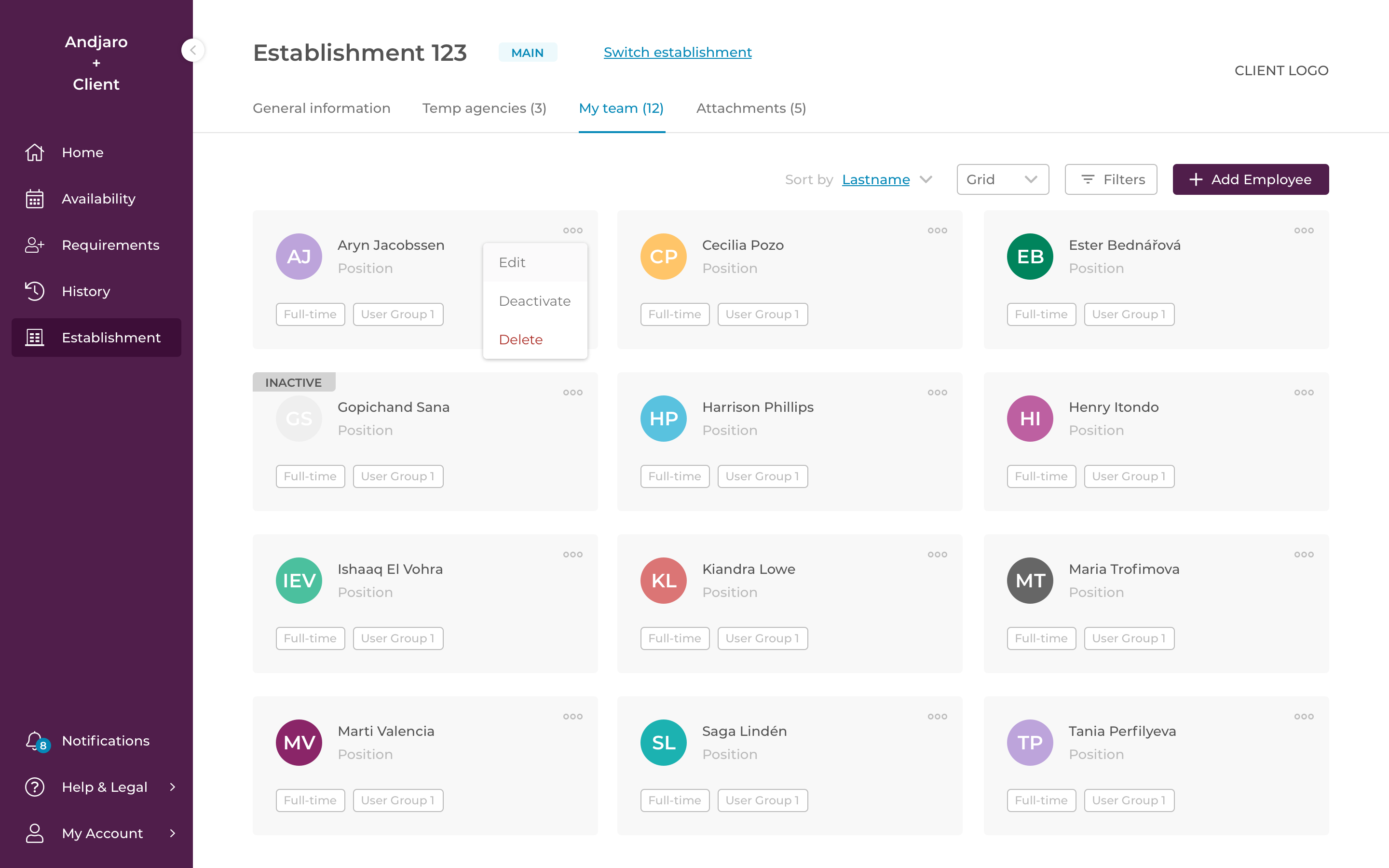
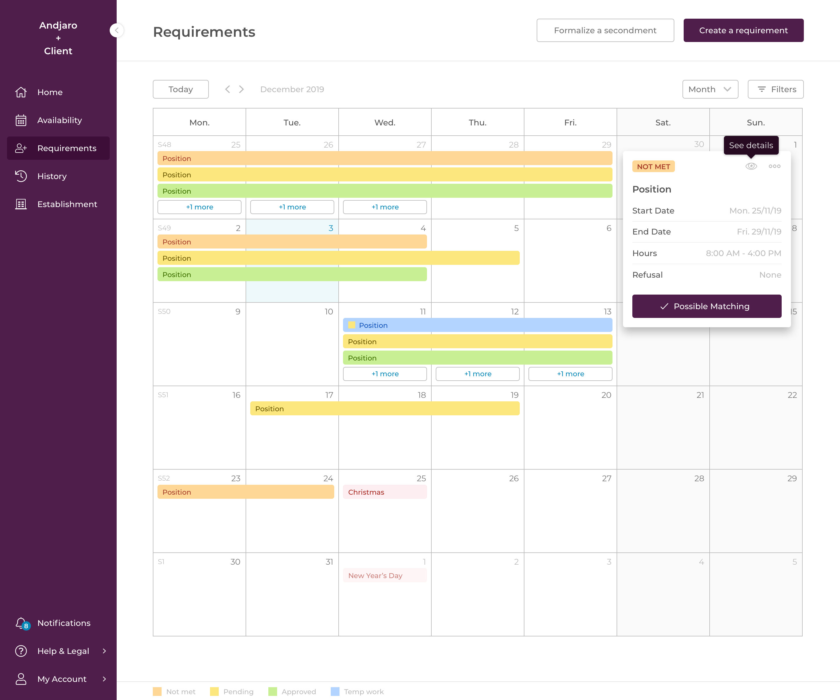
We ended up with a page that allowed managers to make their employees available, a page that allowed to visualize their requirements, to create new ones and to search for available employees, and a page to manage their establishment and their team.
One of the real challenge was to keep every page simple despite the amount of data and customization. Each client, each activity sector was different and everyone wanted to have information that others didn't necessarily want.
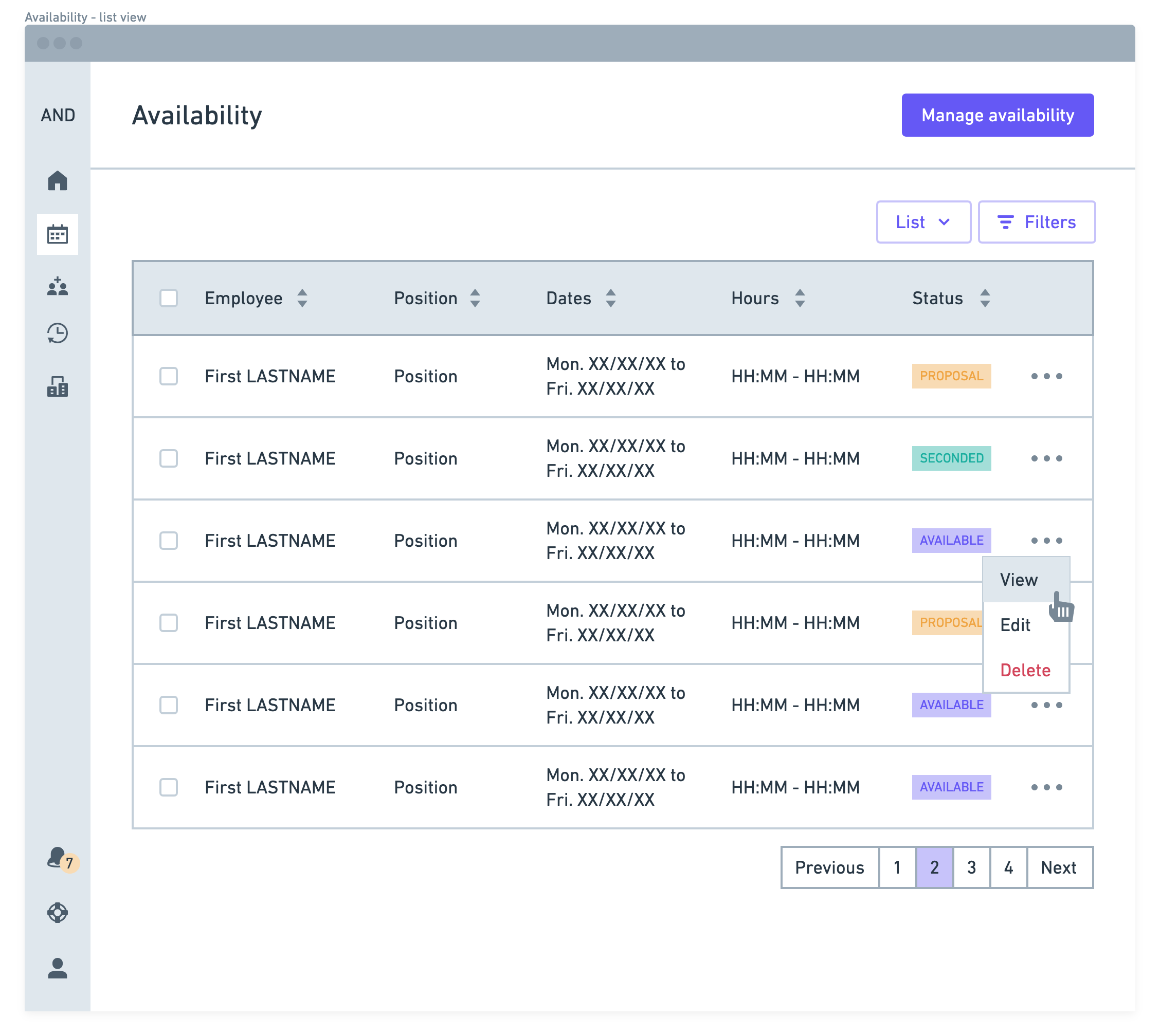
For availability and requirements statuses, we used color codes associated with a label to make it understandable by people with disabilities. Using such color codes make the elements more easily identifiable.
We also spent a lot of time on the prioritization of the information.
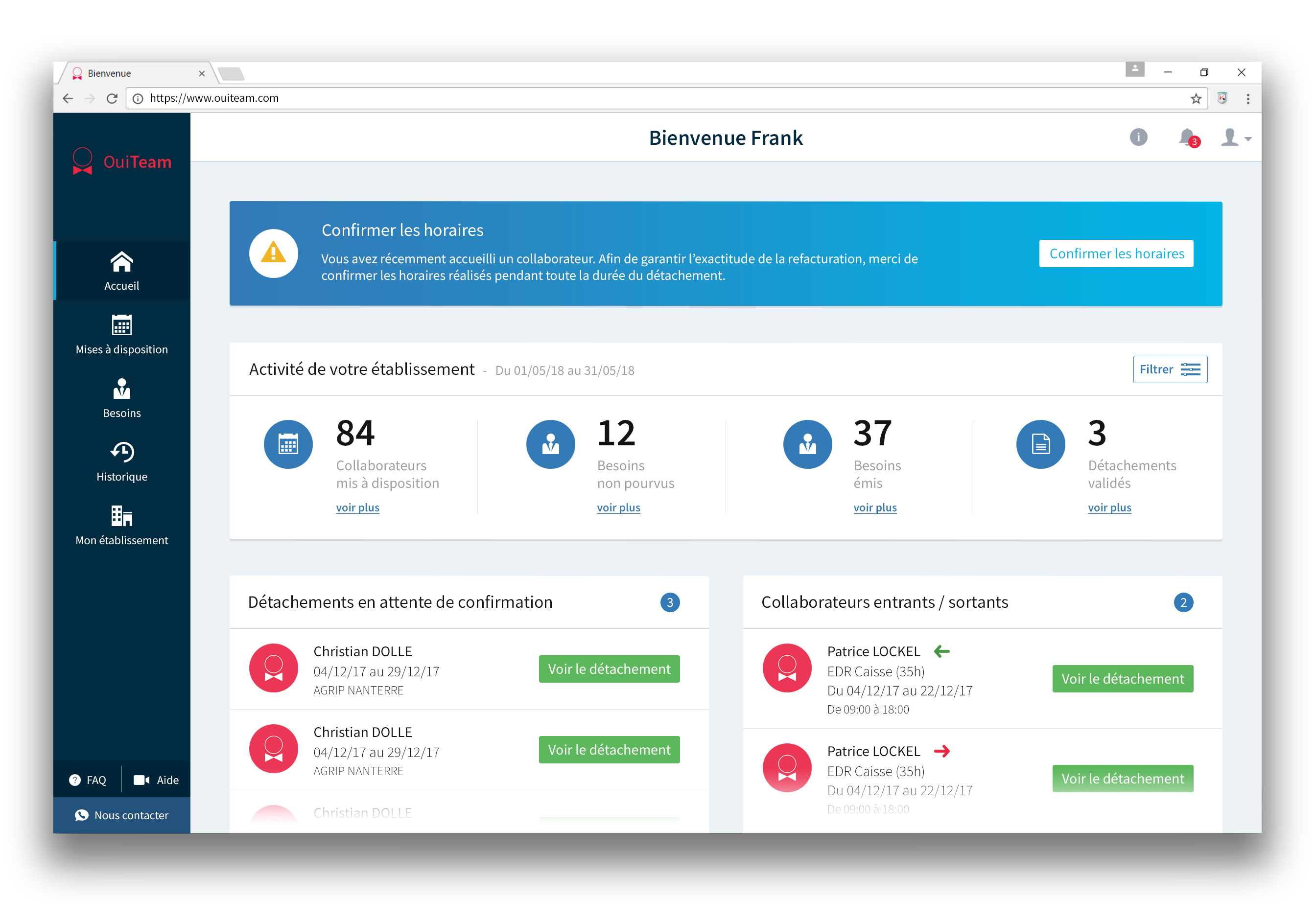
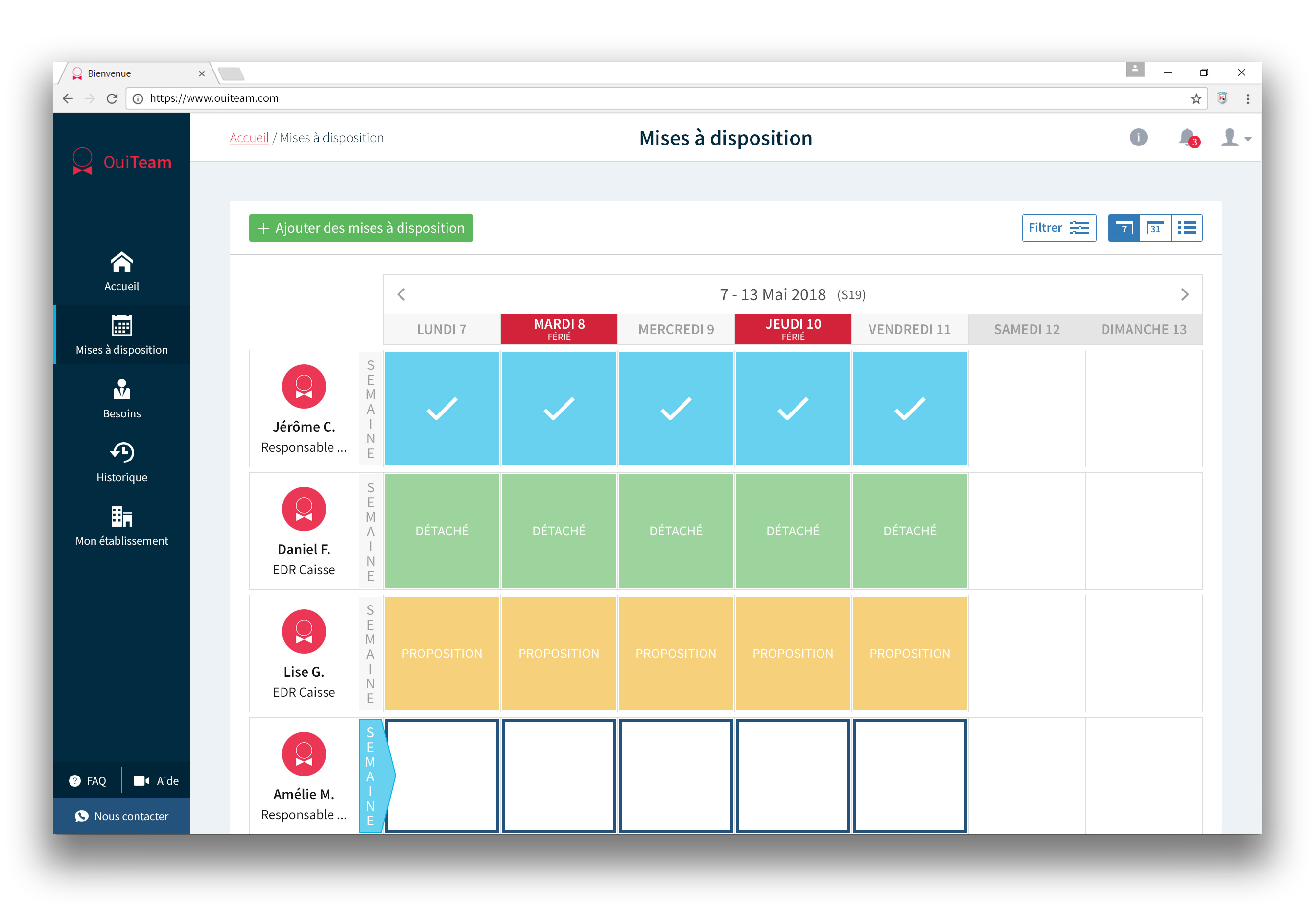
2018
The second version was more a design facelift than a real major change.
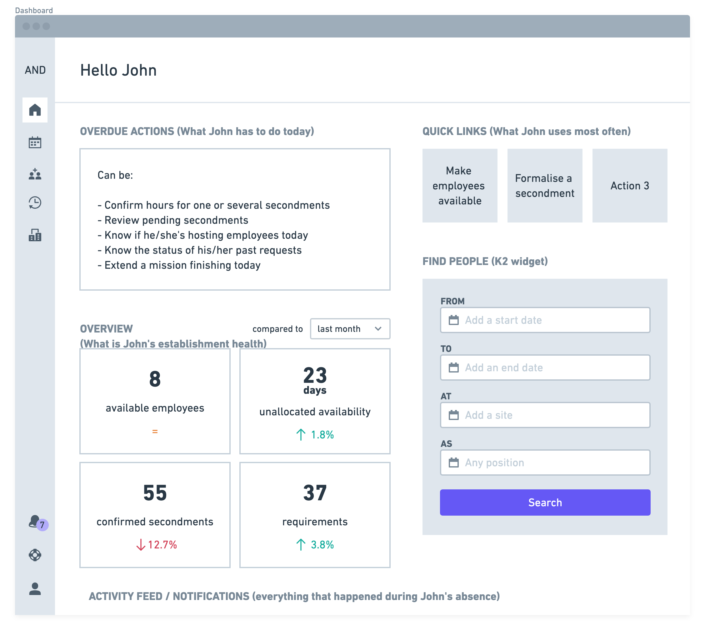
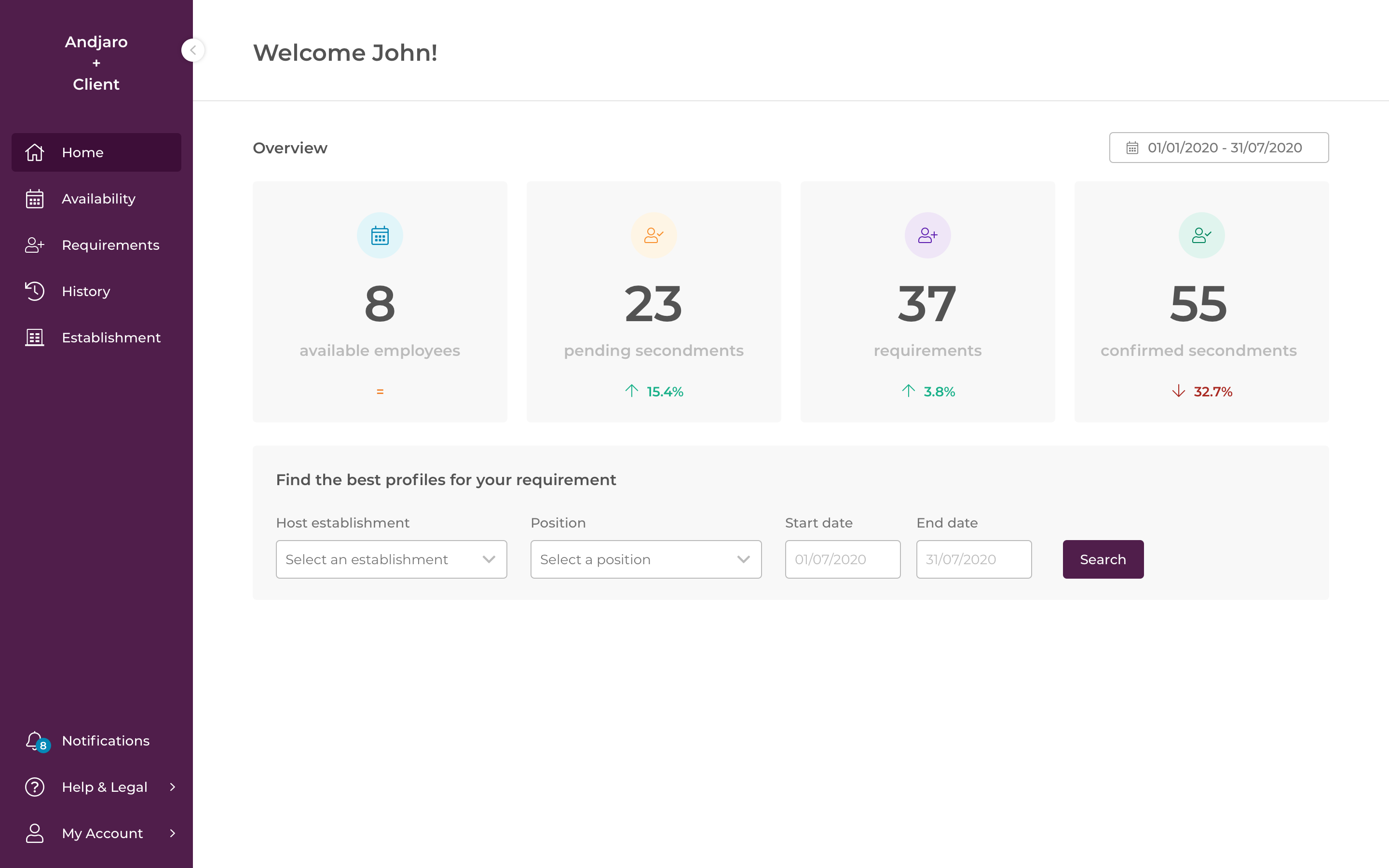
The homepage has been reworked to remove the map that allowed to find available employees and make a kind of dashboard that would allow users to manage their establishment.
We got rid of the red color, especially on buttons.
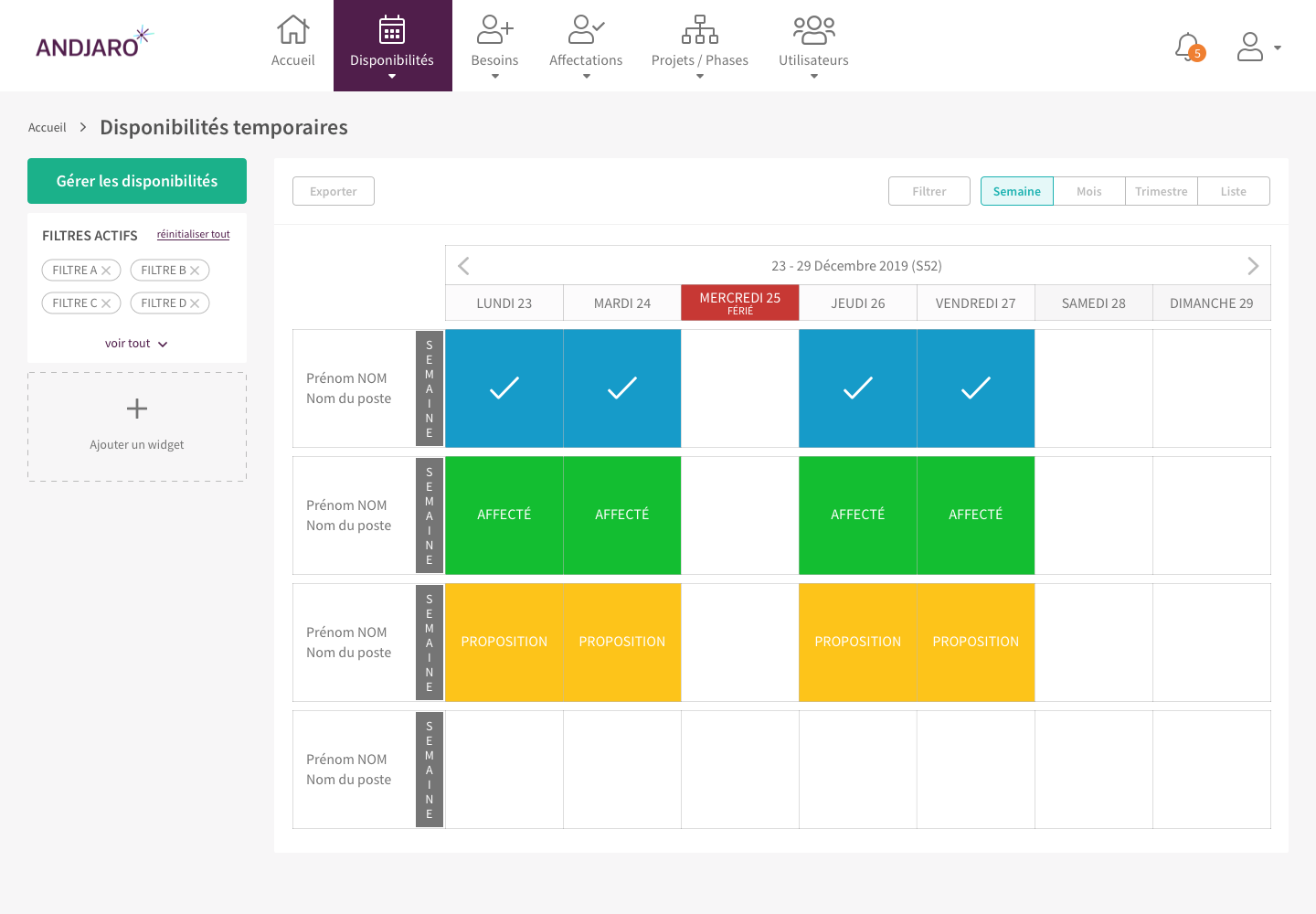
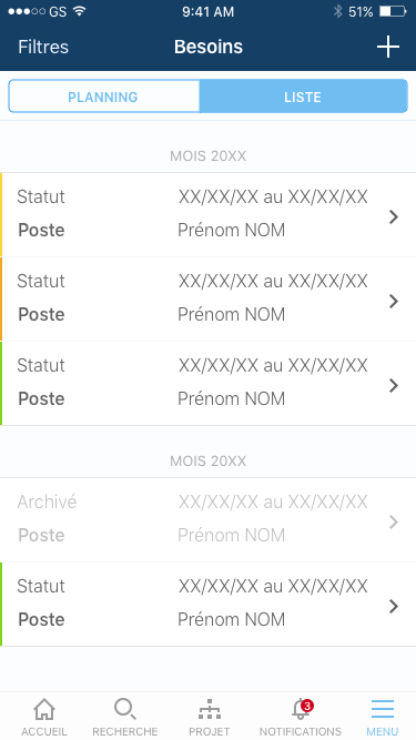
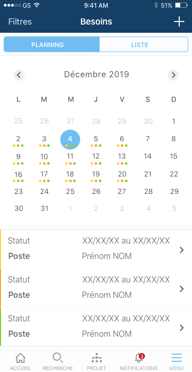
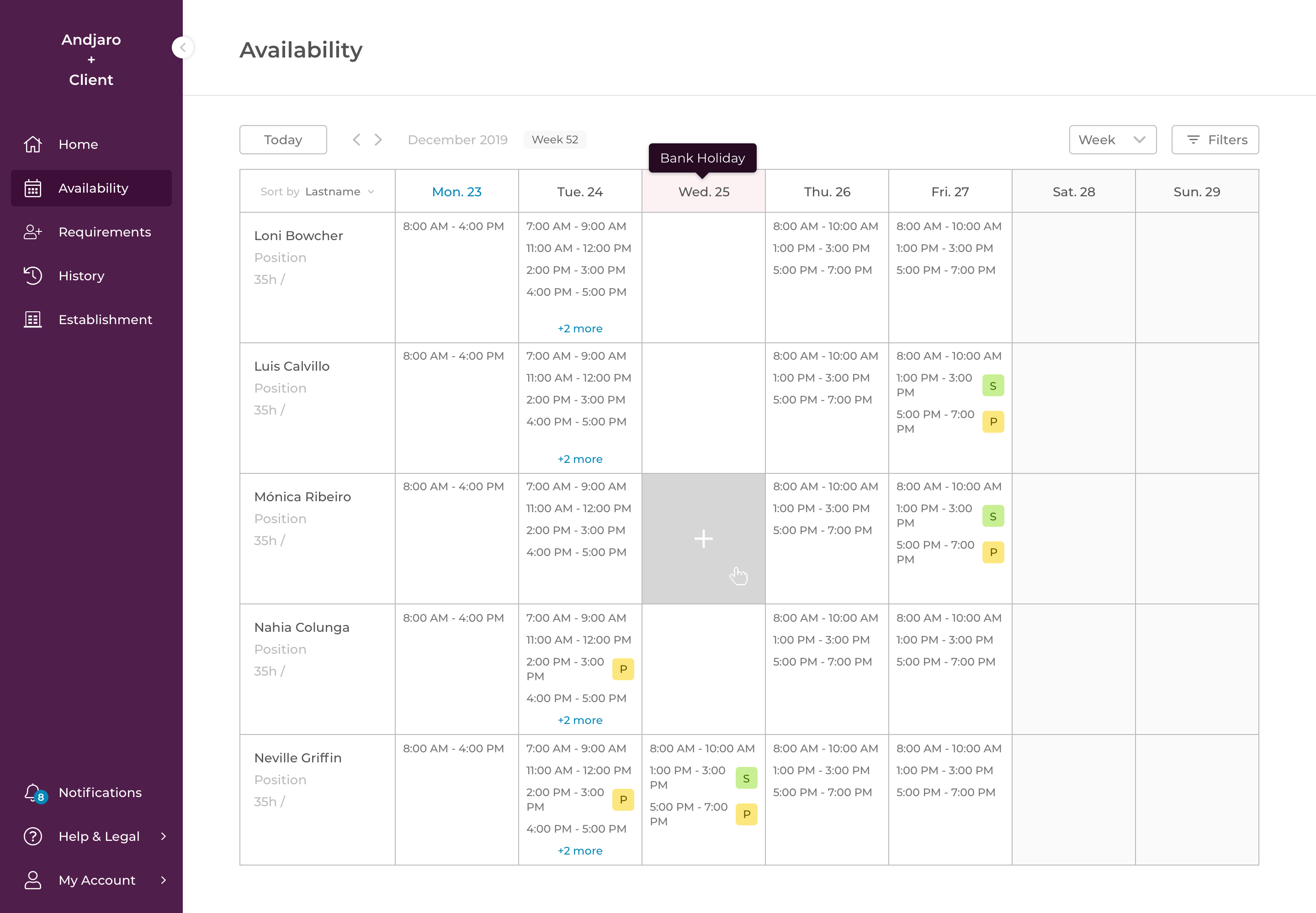
We kept the original layout but worked on a new more classic and simple/light format for calendars with the possibility to browse week by week or month by month whereas before we were limited to a week view.
Rework
The legacy becoming more and more difficult to manage, modify and improve, we wanted to do a complete overhaul of our system.
We defined with the stakeholders and all the teams what we wanted and what the application should do or not do and I started to design both for web and mobile.
We were starting from scratch so everything was possible. Two navigation proposals were made, on the left and on top. The preference was to the one on top which allowed to free up a lot of space for the main content.
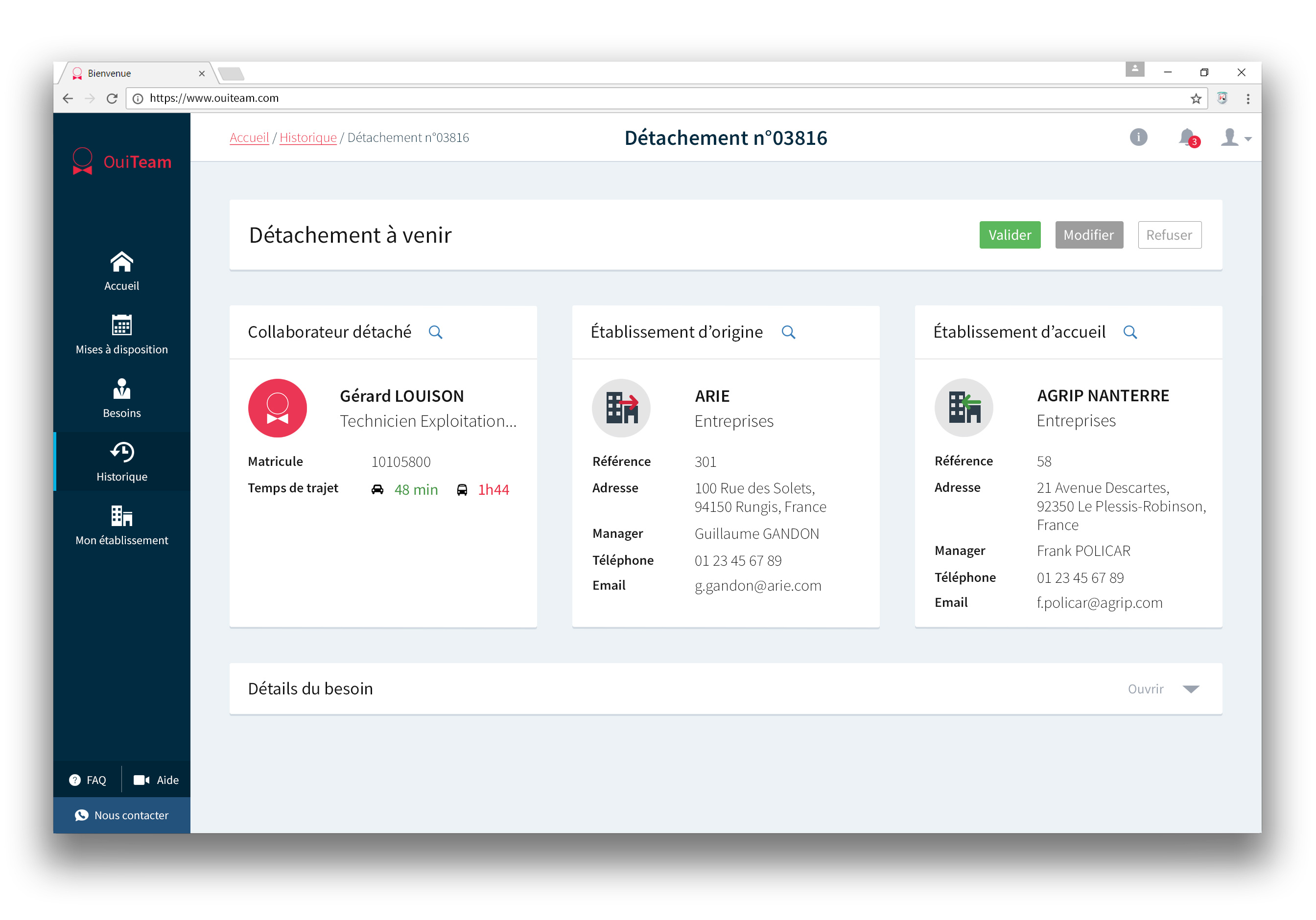
We removed OuiTeam and its colors and started to use Andjaro and its new brand colors. We changed the layout especially for details pages and we changed the way to search for employees.
Regarding the mobile application, we used classic patterns so that users didn't get lost (bottom menu, sub navigation with tabs, sliding elements...).
This rework was unfortunately not successful. We couldn't manage both the development of this new product and the improvement of the existing legacy which was important for our clients.
2019 - 2020
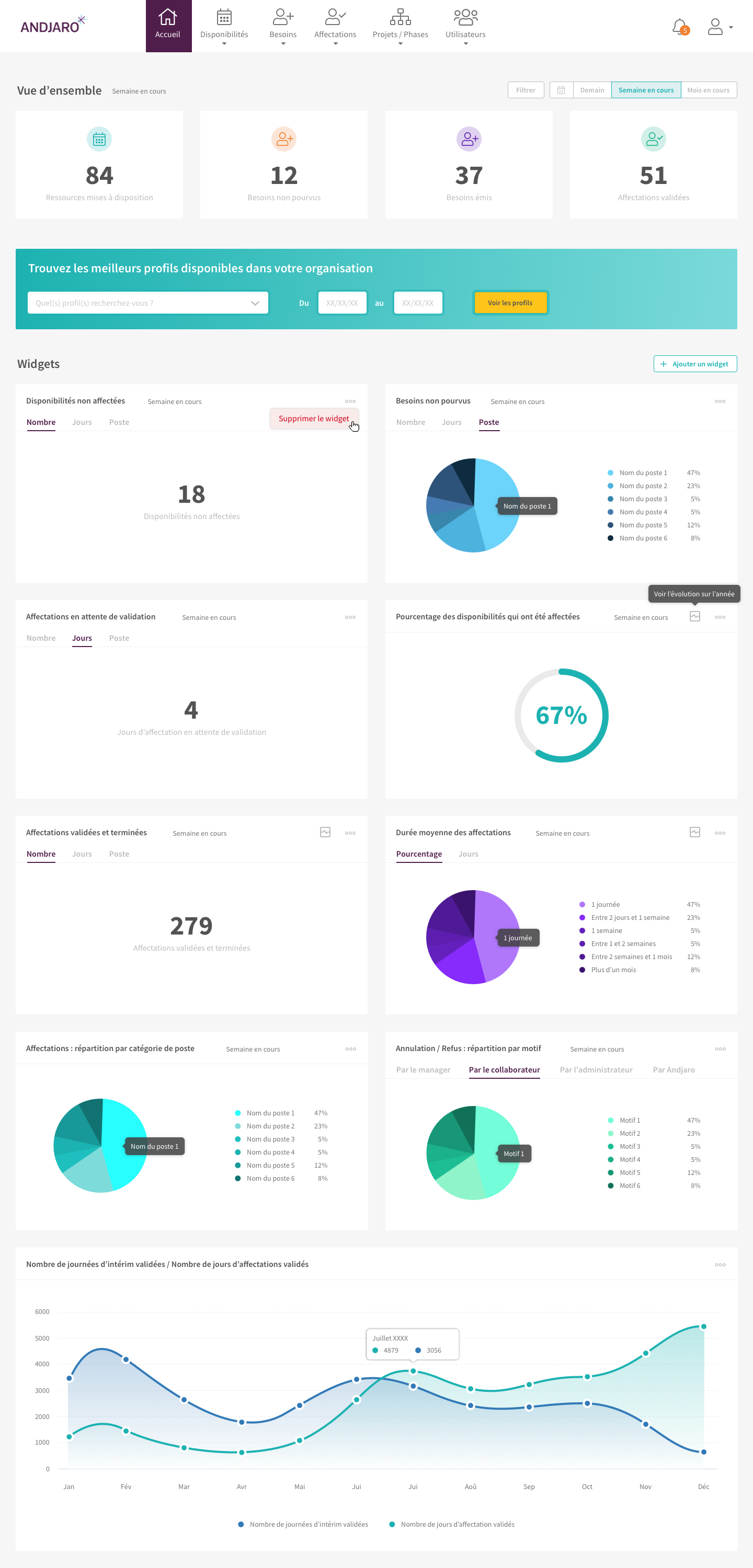
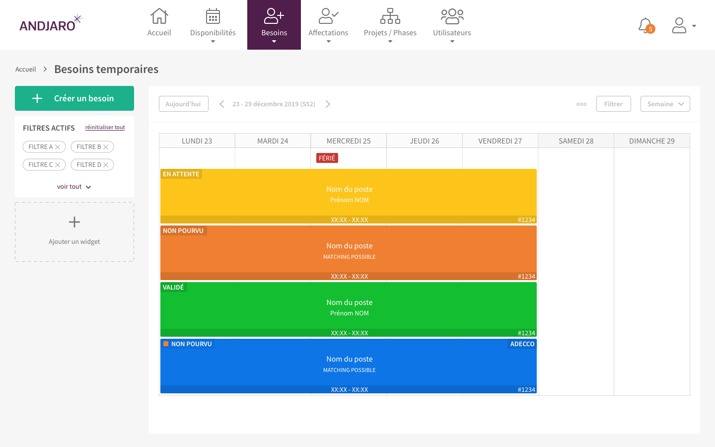
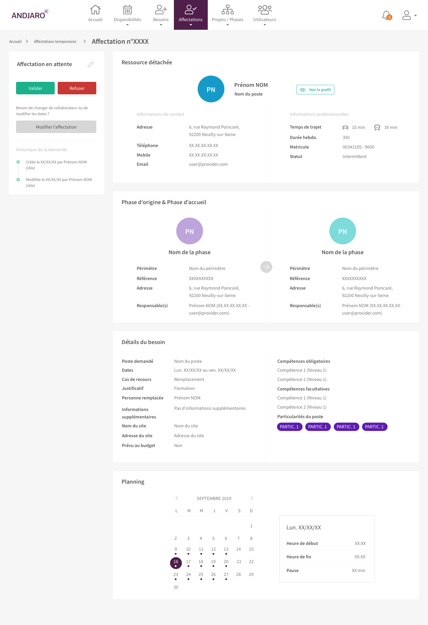
After the unsuccessful rework, we wanted to refresh the design and have something more modern. The idea was also to have even more prioritization, to think in components rather than in pages, to refresh the design, to simplify what could be, to ensure that users spend less time looking for the right information or performing an action.
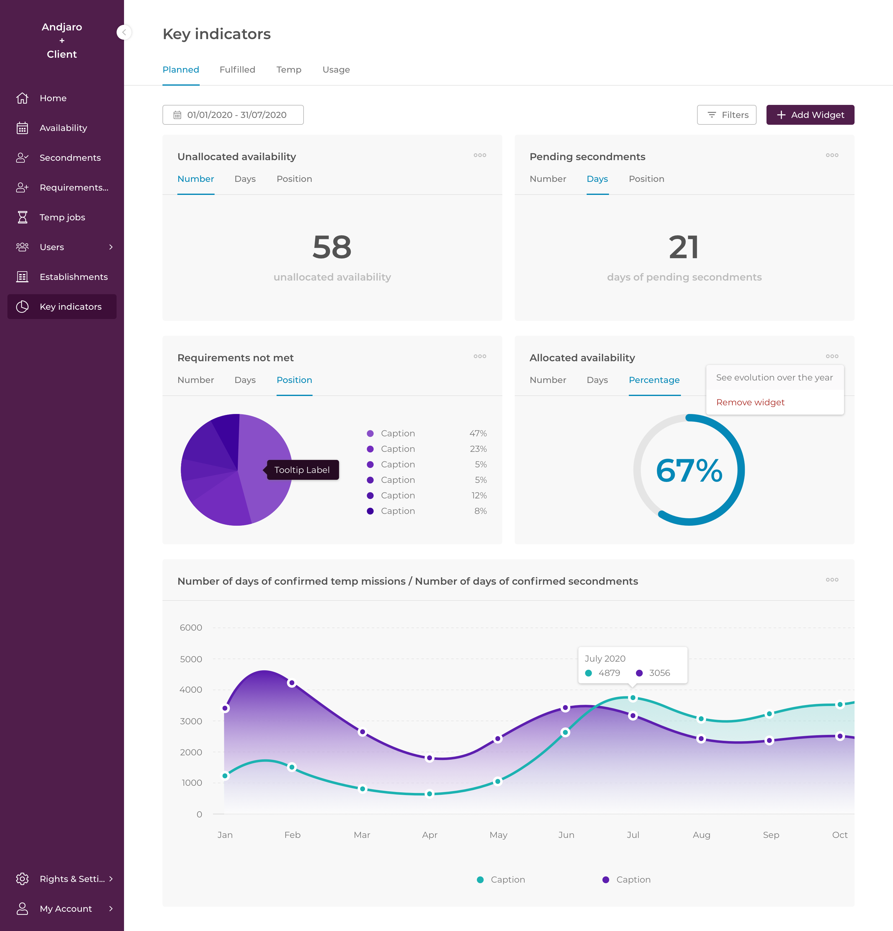
There was a big design refactoring of the calendars. I spent a lot of time studying the behavior of calendars (Google, Outlook, Calendly ...). I reworked on the colors, the statuses to make sure contrast was ok for everything.
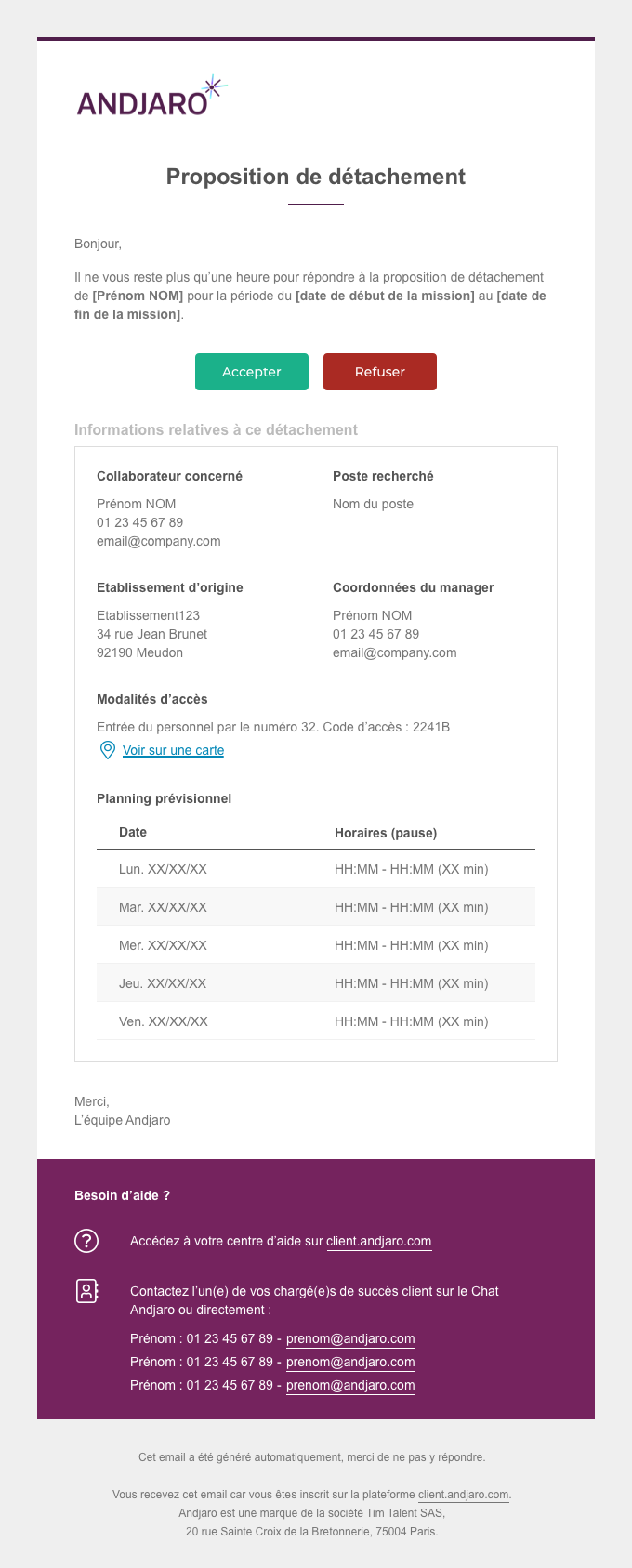
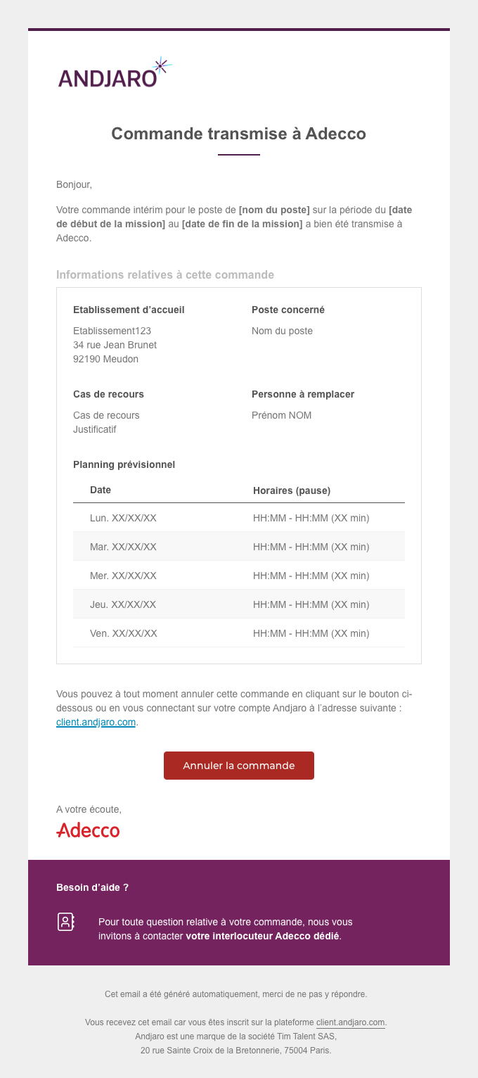
I started to create our own design system to manage everything and rework on our core feature. I also redesigned the mobile version which is now a progressive web app and all the emails to reflect our brand redesign, simplify and prioritize information.
Finally, I led a group of 4 people (product, sales, marketing, operations) whose goal was to think about and define our personas. I wrote the profiles of two personas and helped format the other ones.
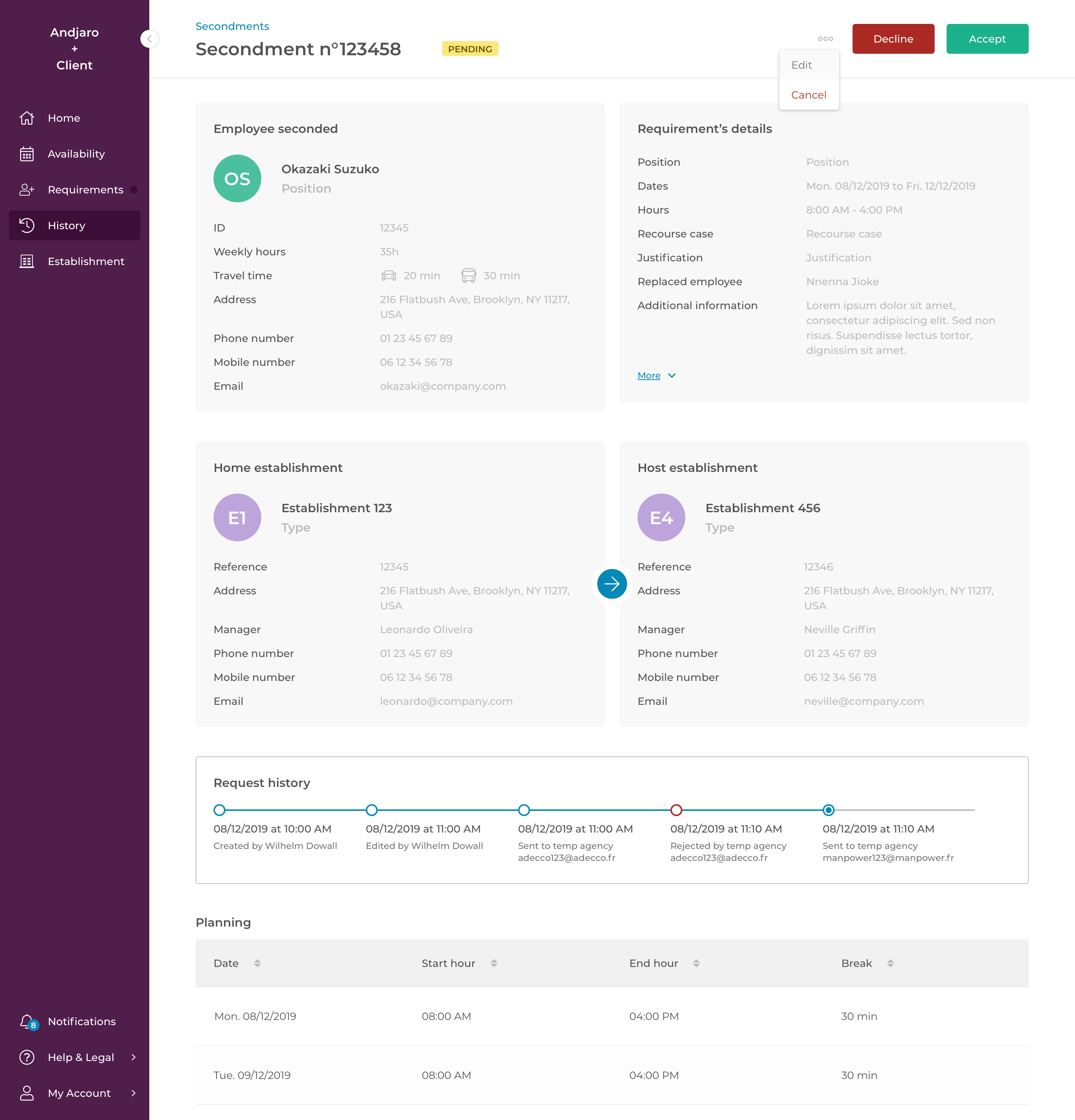
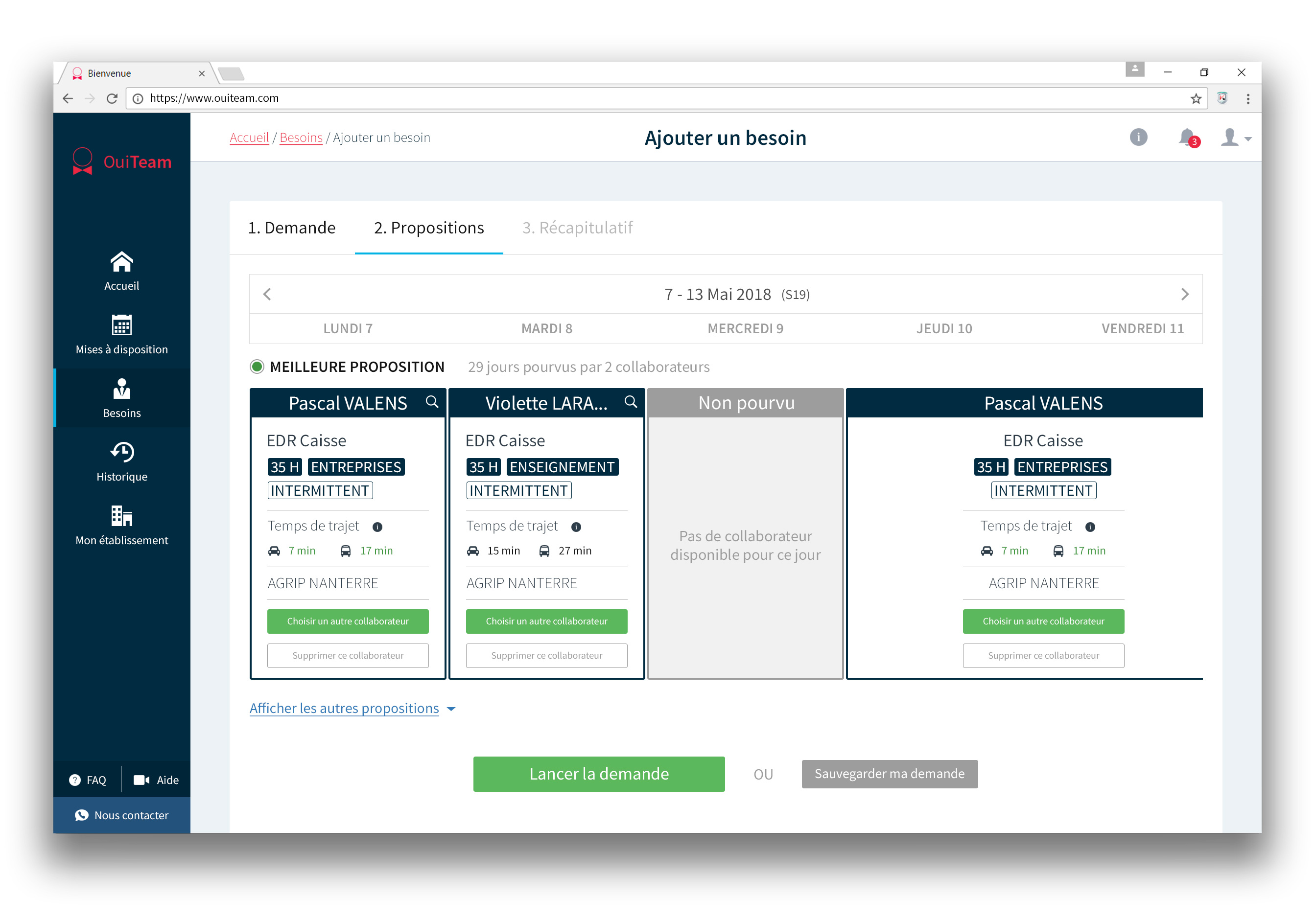
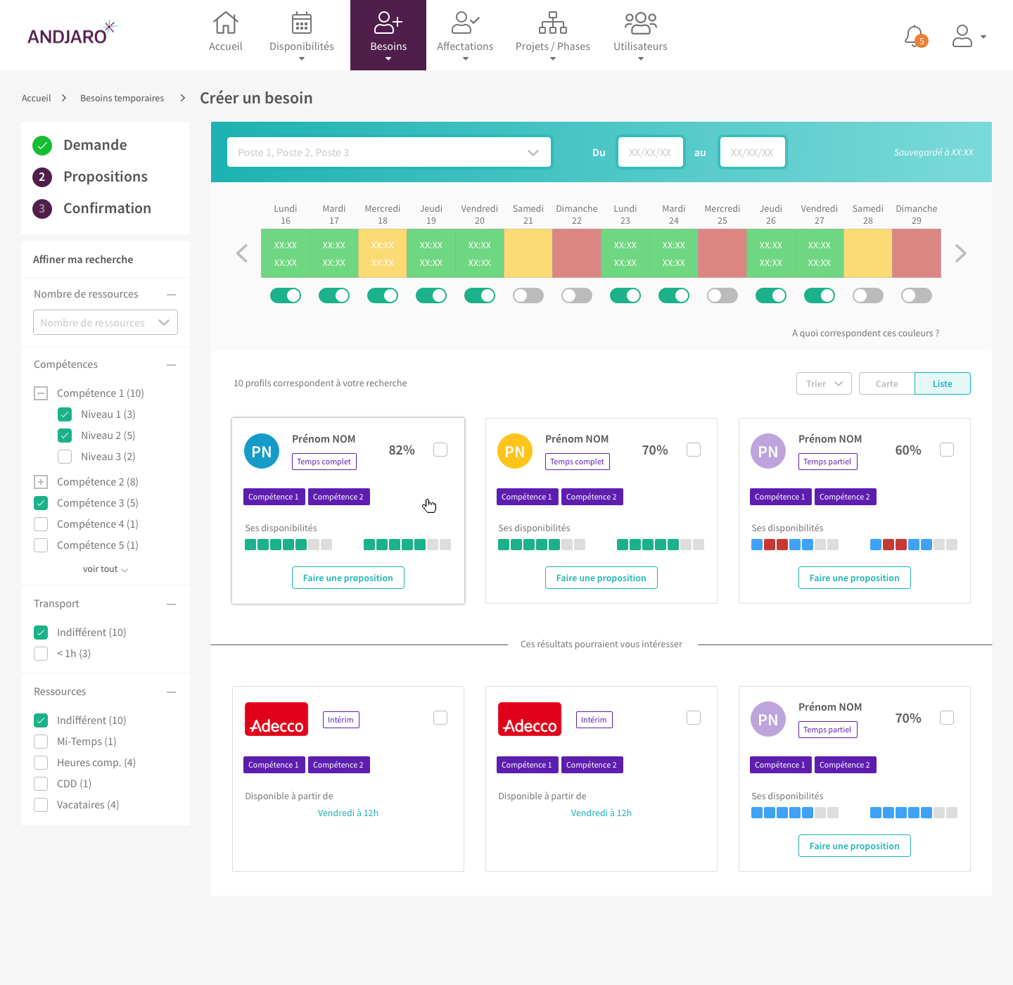
Rethink K2, Andjaro's core feature
Goal:
The goal was to deliver new UX and UI for K2, Andjaro's core feature to help increase the number of staff transfers.
Context:
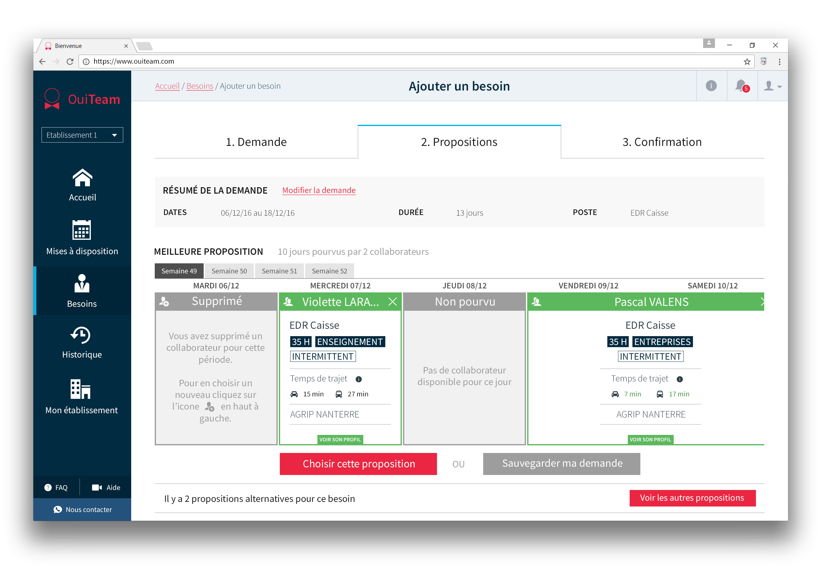
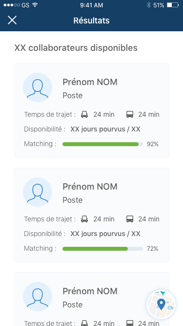
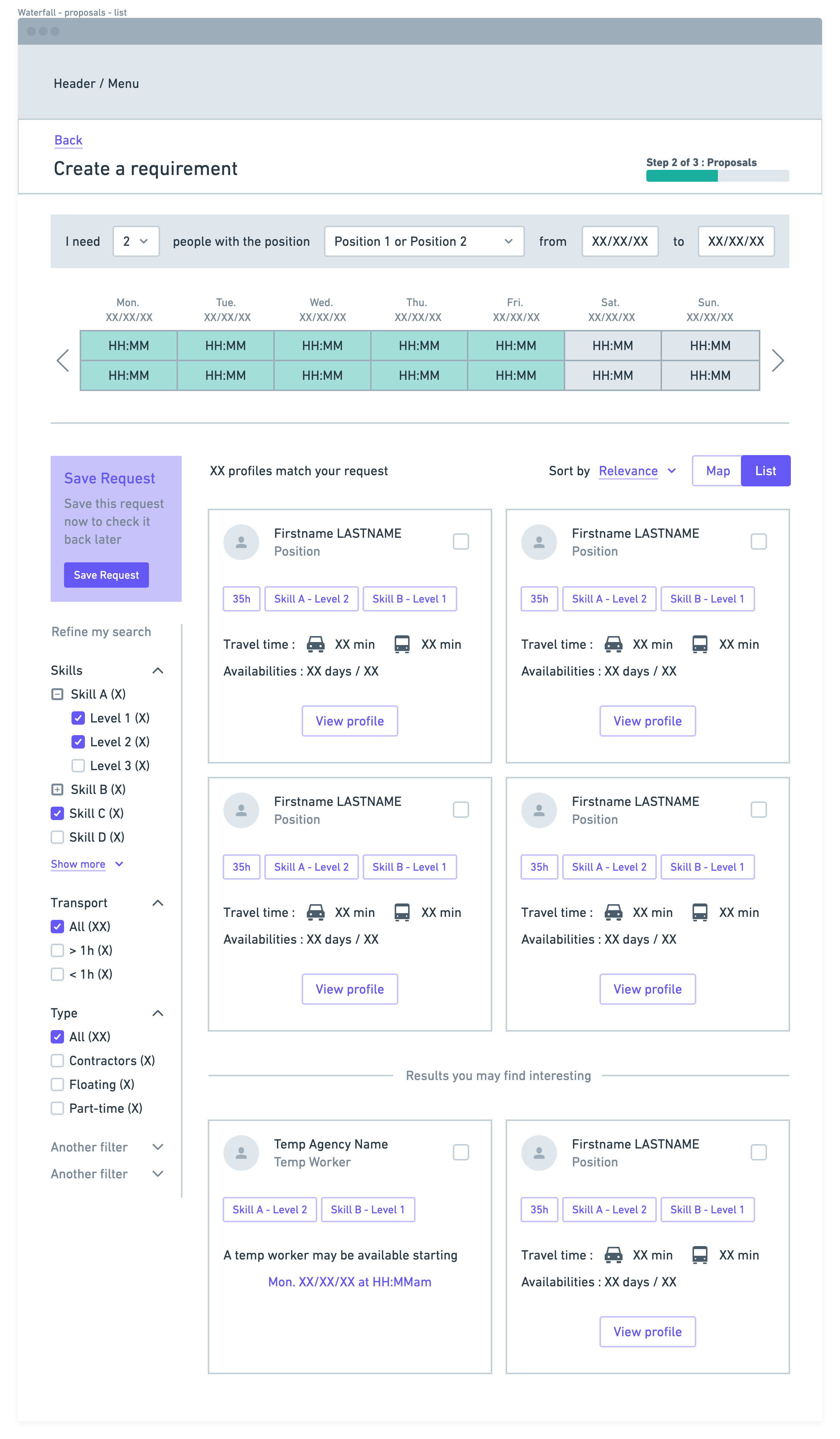
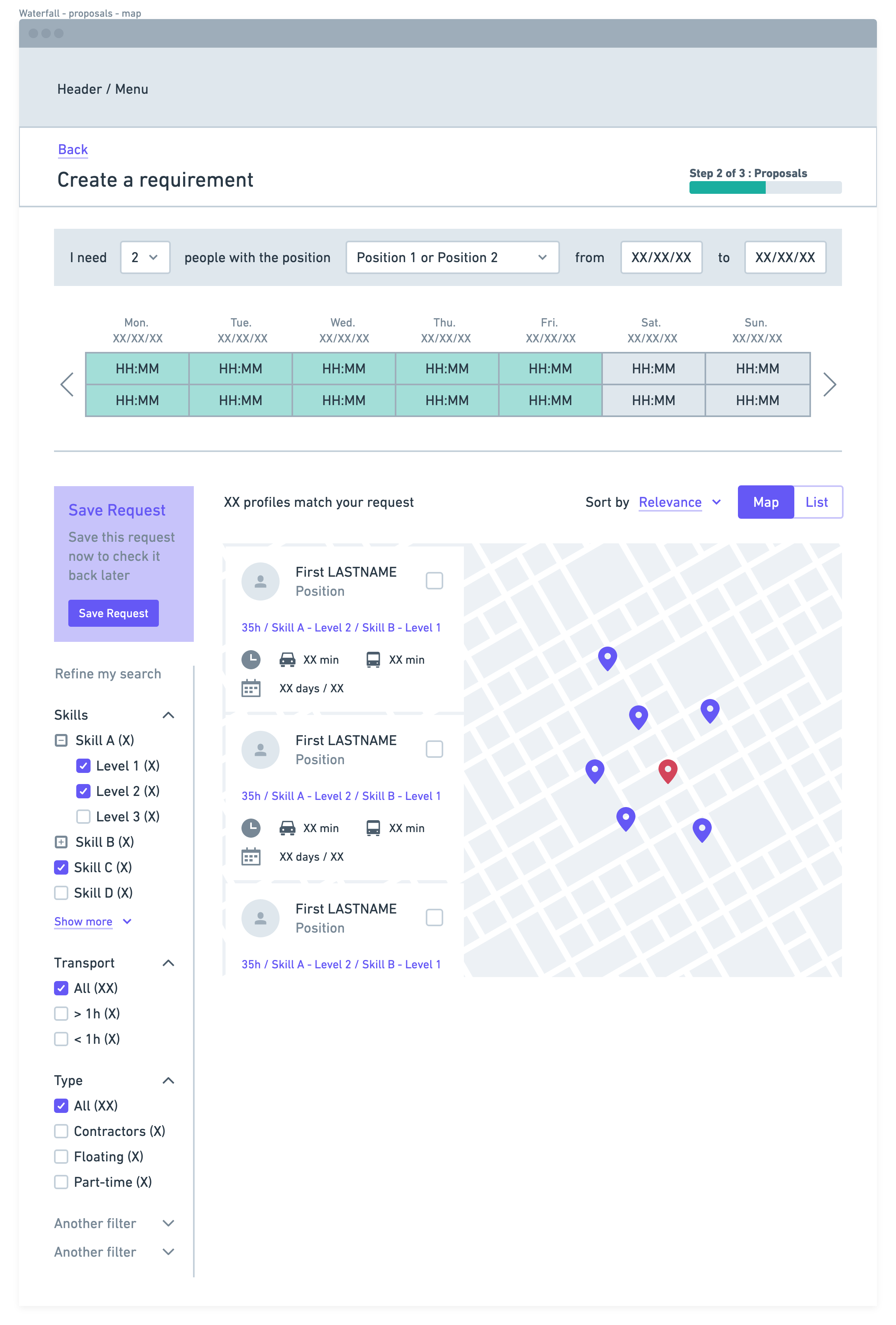
The whole flow was not user friendly at all. Users had to complete a very long form entirely before accessing a list of available employees.
The matching algorithm was too strict and only returned employees with a perfect matching.
Actions:
I interviewed a small group of users to have their feedback on the current flow, to understand how they used the product and what could be their ideal solution.
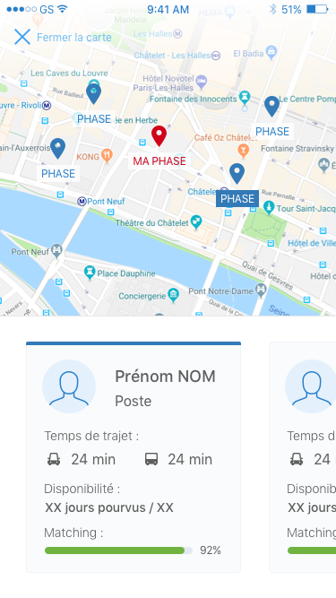
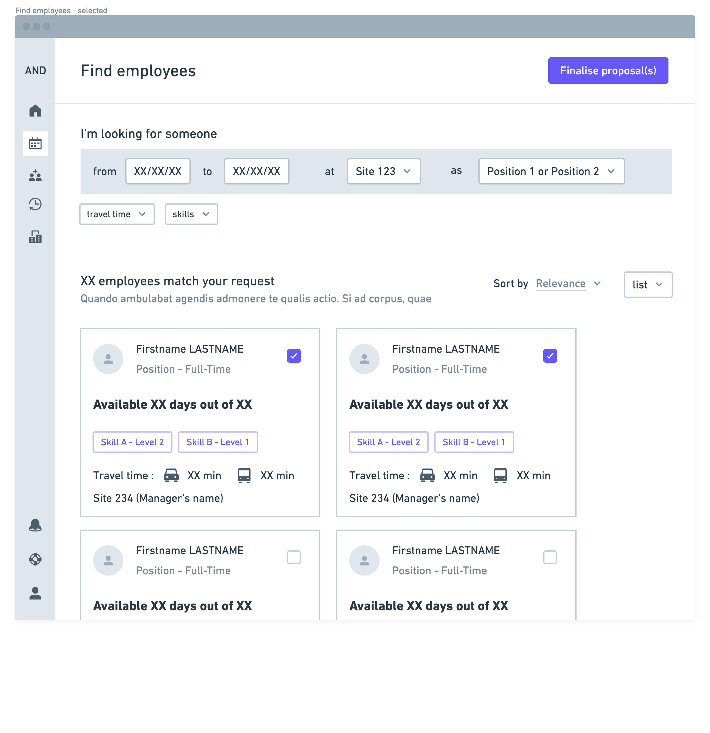
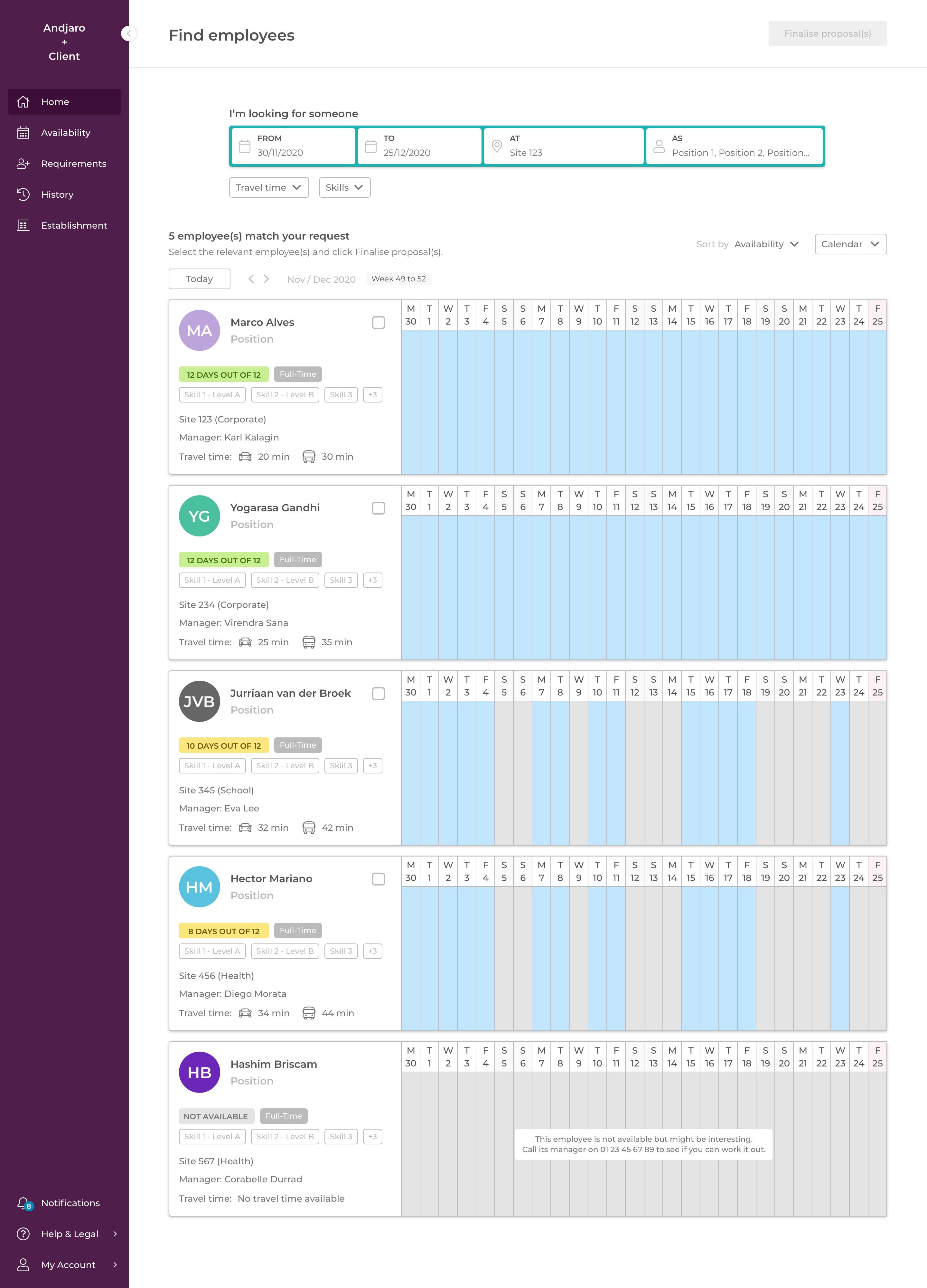
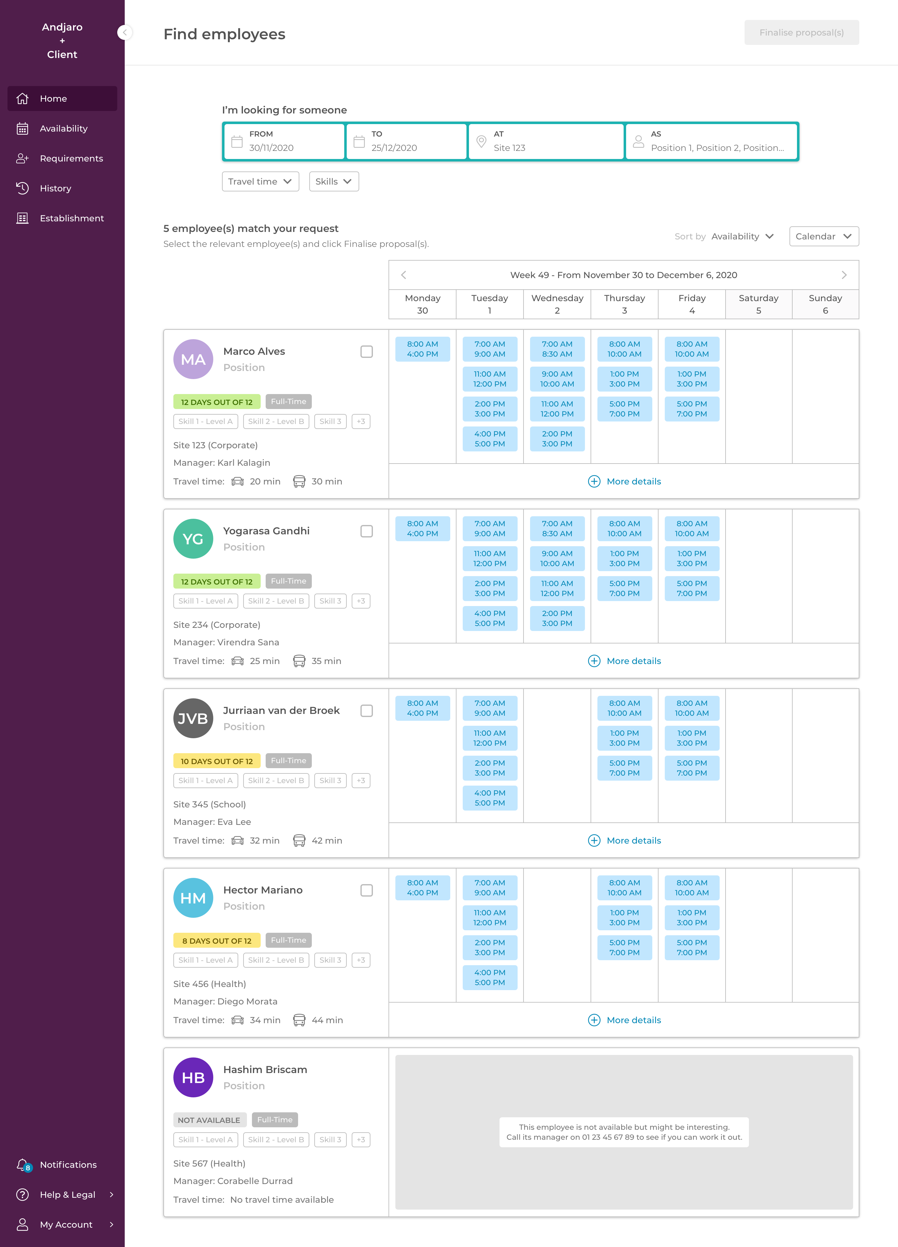
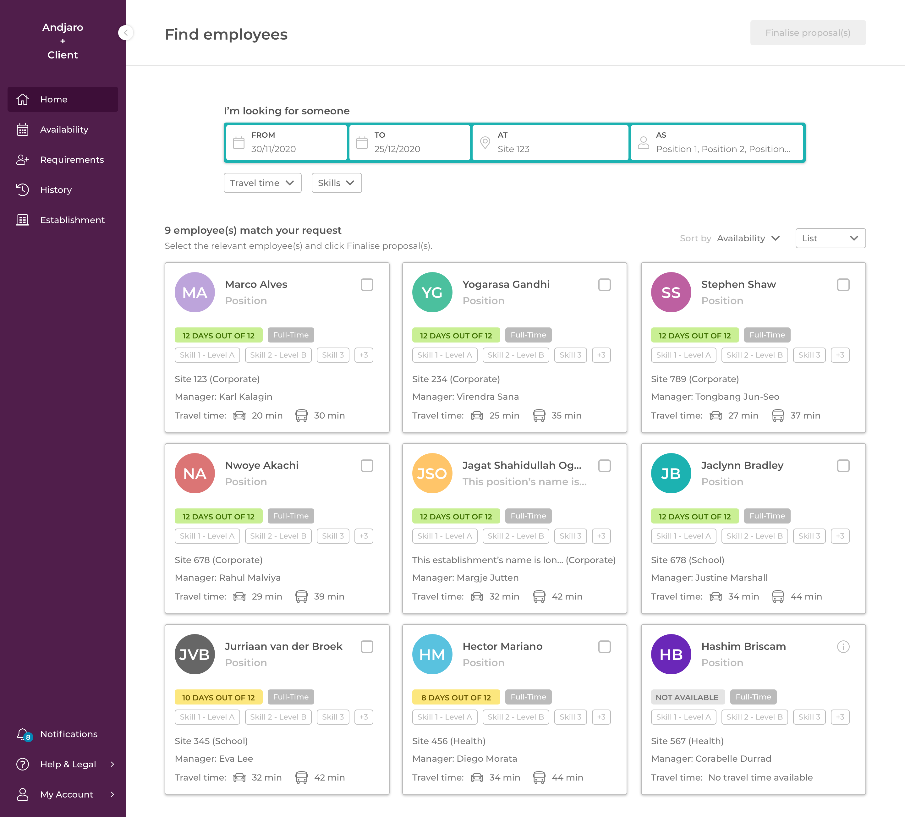
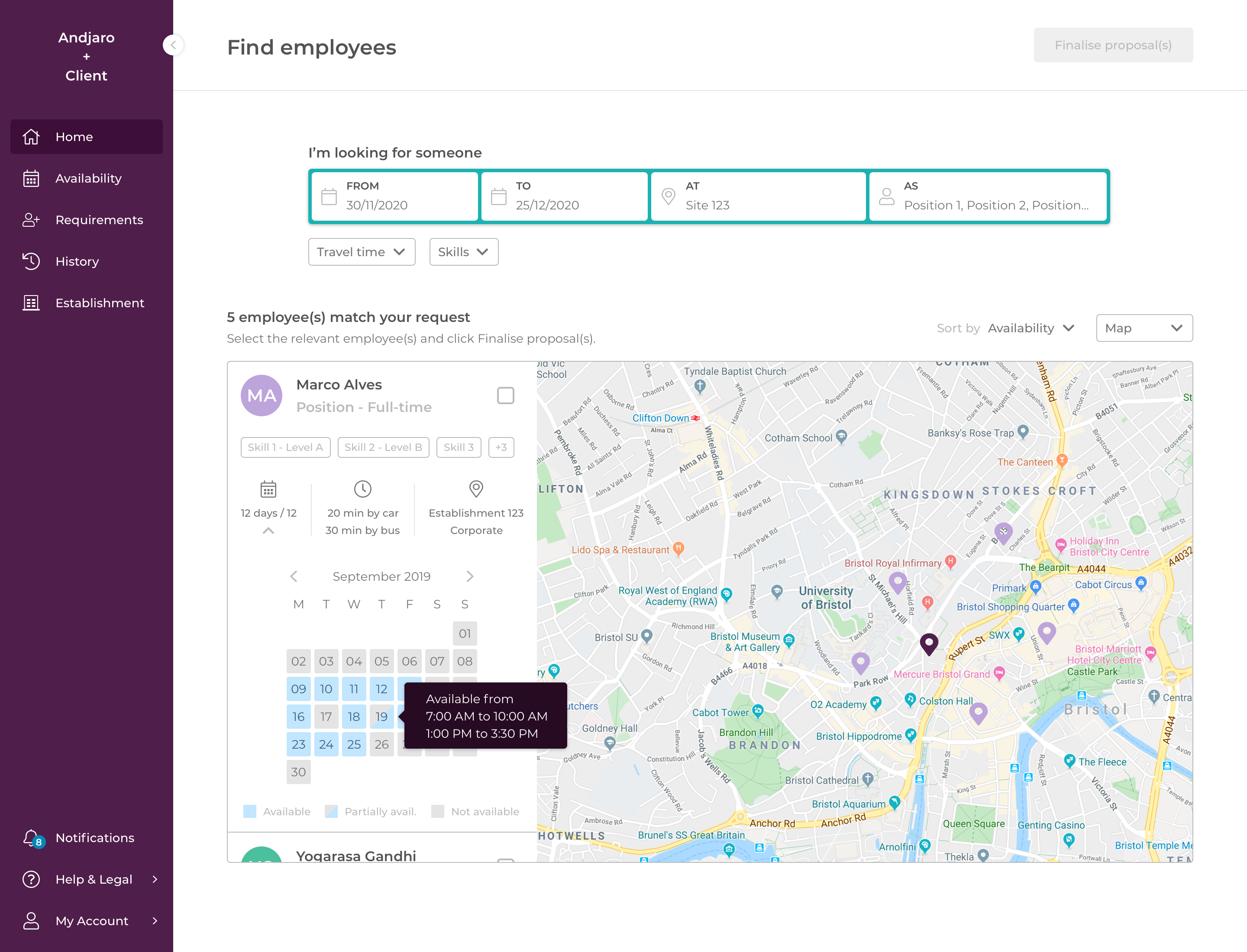
Based on these interviews and discussions with stakeholders, I led a complete rework of the feature that included a very small form displayed as a sentence (I'm looking for someone from Start Date to End Date at This place as Position), some optional filters to narrow the search and different views to display the results (card, calendar, map).
Outcomes:
We saw an increase in the number of staff transfers for the client with the new flow activated.
Some users feedback: "Page is clear and looks very nice", "There's a lot more available employees than before", "I make a choice by myself" (versus a choice made by an algorithm)
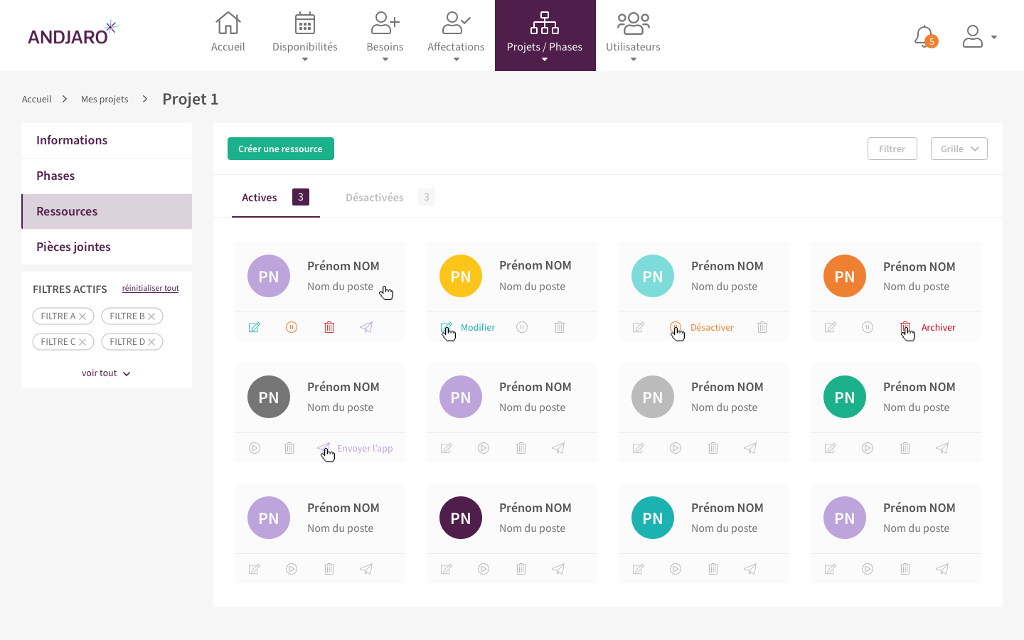
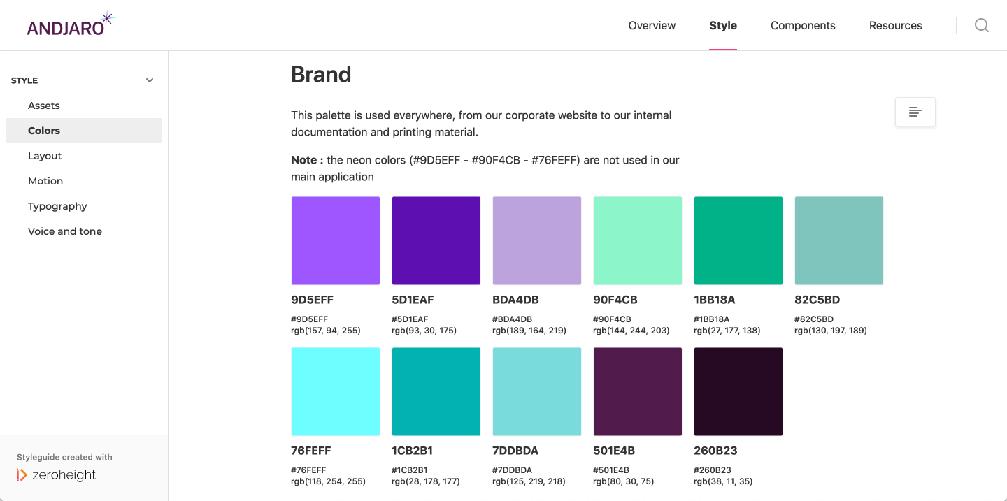
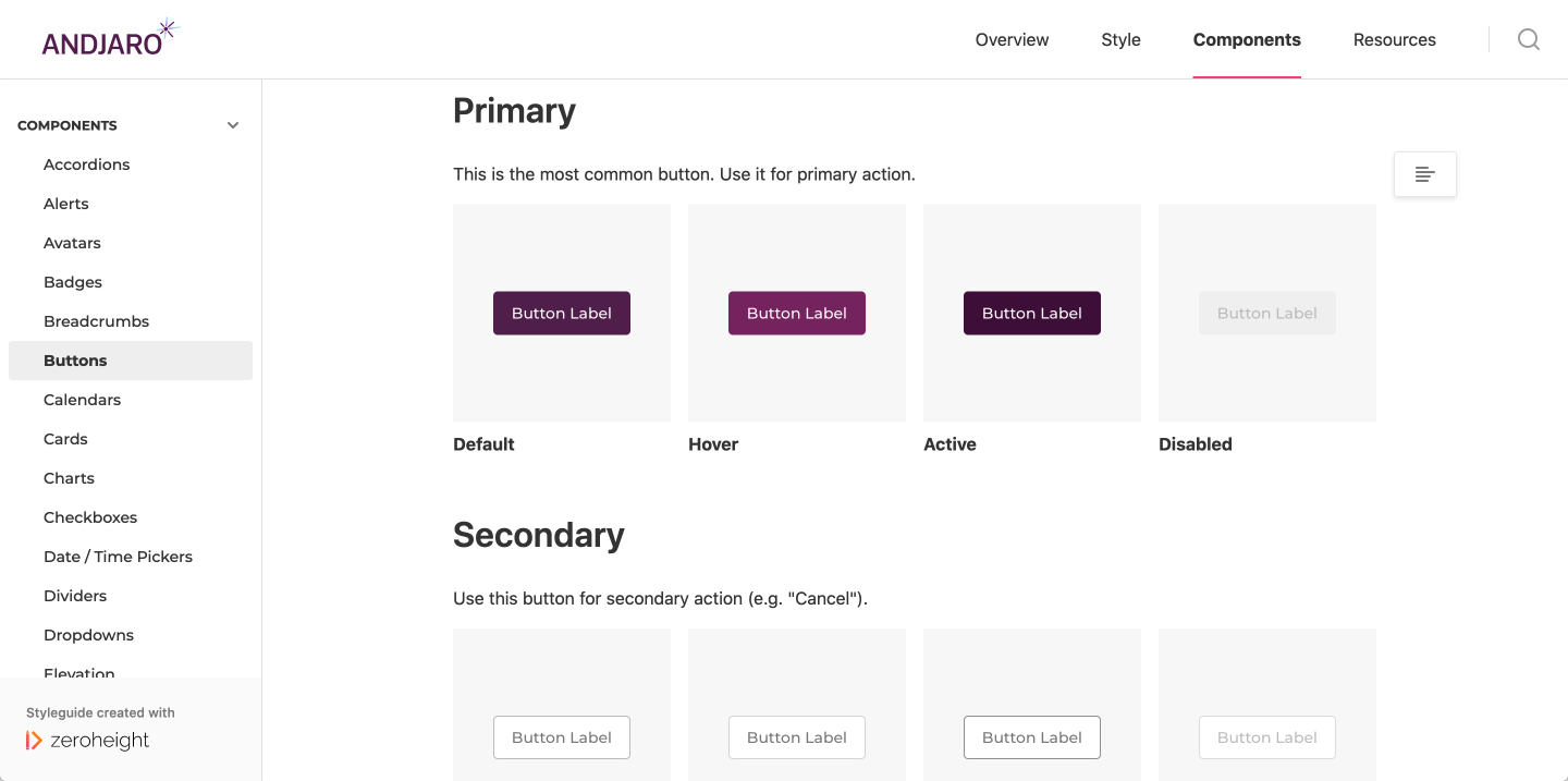
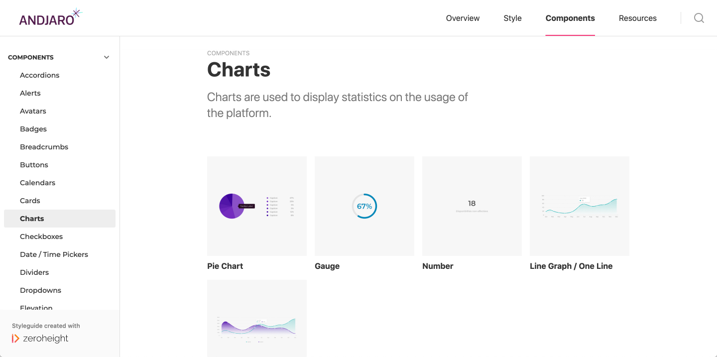
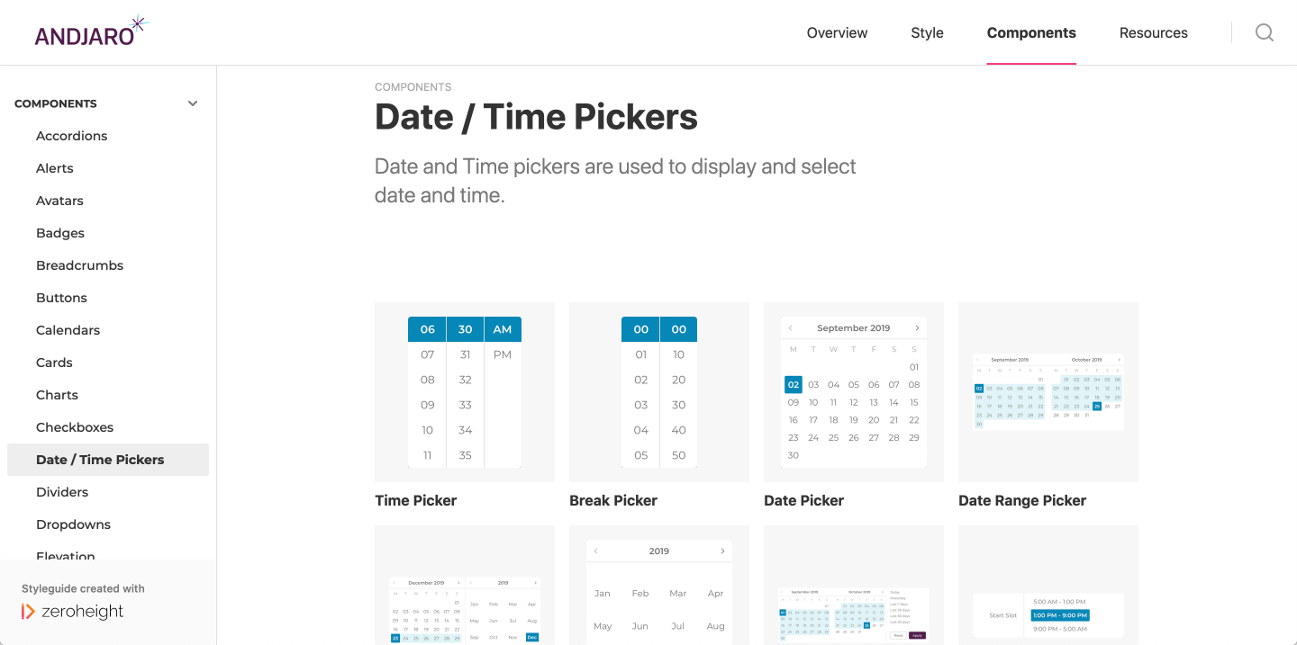
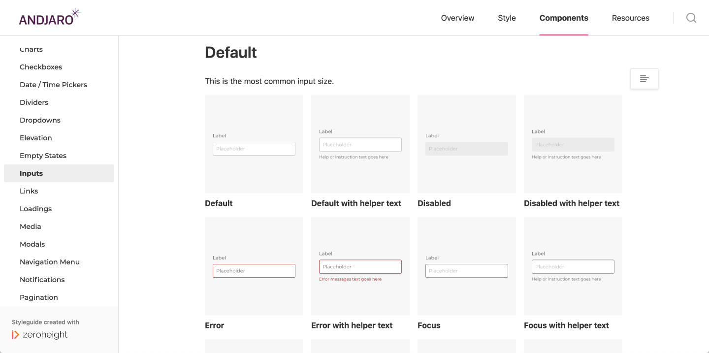
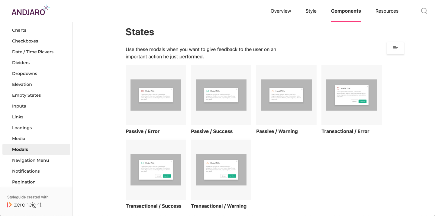
Design System
The previous work relies heavily on the design system created and available on zeroheight.
I started to get interested in atomic design and design system while working on the last version.
I was inspired by three design systems in particular: IBM's Carbon Design, Atlassian Design System and GOV.UK Design System.
Goal:
The goal was to create a design system to help reduce development time and harmonize the user experience across web and mobile applications.
Context:
We had a legacy application with different technologies, libraries and styles. There were a lot of inconsistencies from one page to another, from one element to another (color, hierarchy, spacing, action...). The brand redesign that happened earlier was not reflected on the web and mobile applications.
Actions:
I first made an inventory of all the existing stuff, all the different pages, components, calendars, blocks, forms, etc.
Then, I tried to group them by function, to see what could be merged, what could be removed or simplified and then started to design components.
Thanks to zeroheight, I was able to format the whole design system and wrote what each component was supposed to do, its usage, when to use it or not.
Outcomes:
It was easier to design a new feature or a new page thanks to all these reusable components. We created a shared library for product and tech teams and solid foundation for building a common langage that helped in the execution.
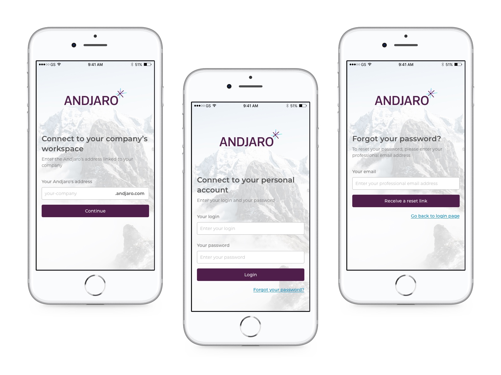
Rethink the employee mobile app
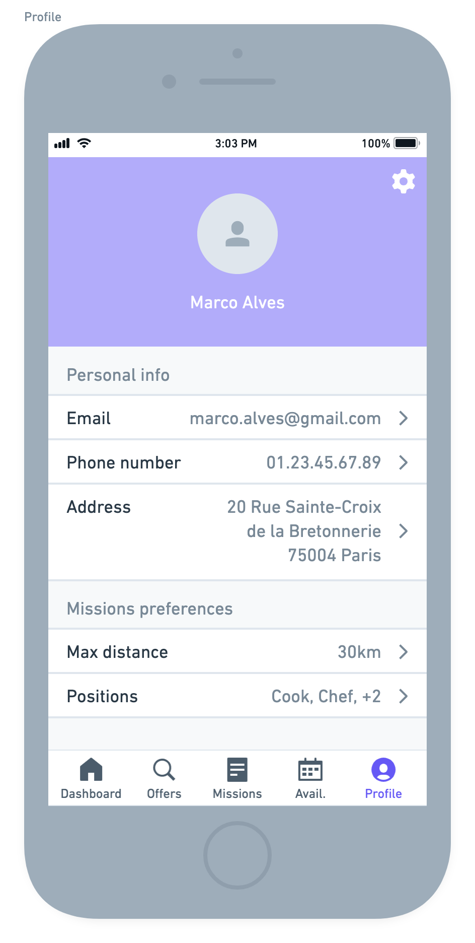
My last job for Andjaro was to think about the future of the employee mobile application.
The latest version was from 2018, the design was old and the features presented were not or no longer adapted with the new positioning and what we wanted to be able to do with this application.
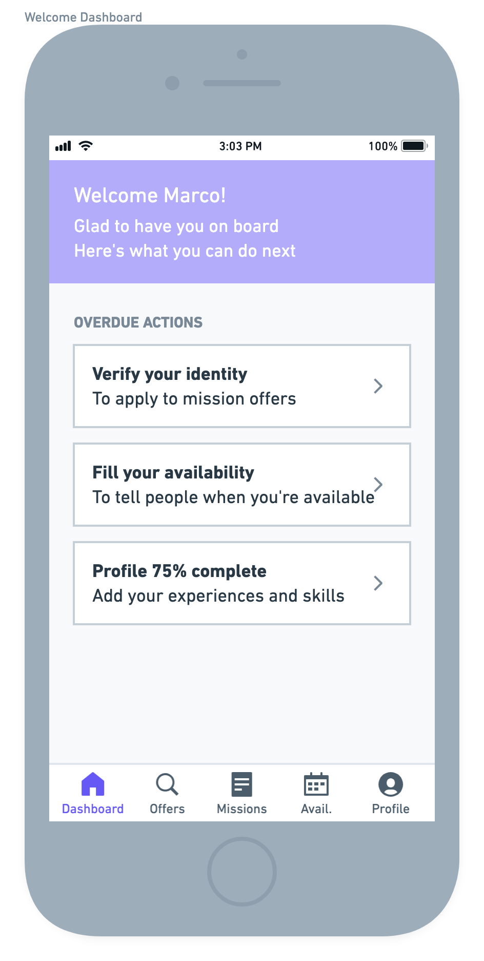
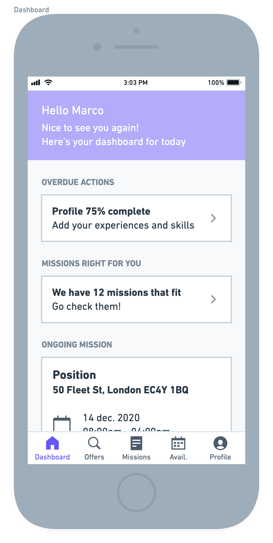
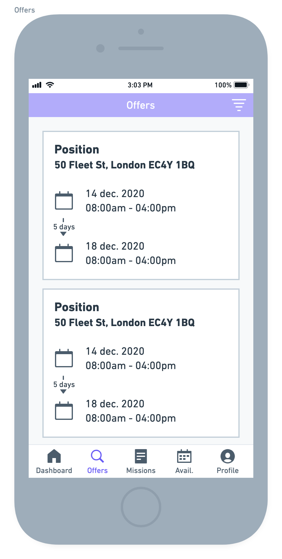
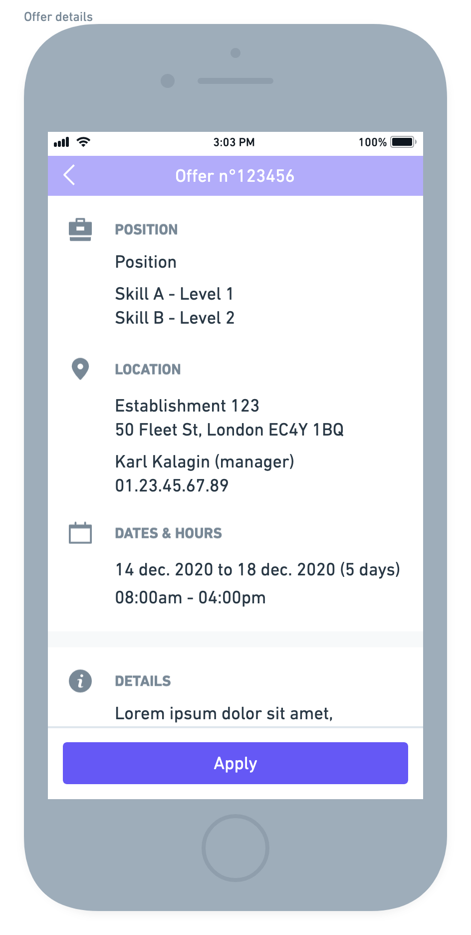
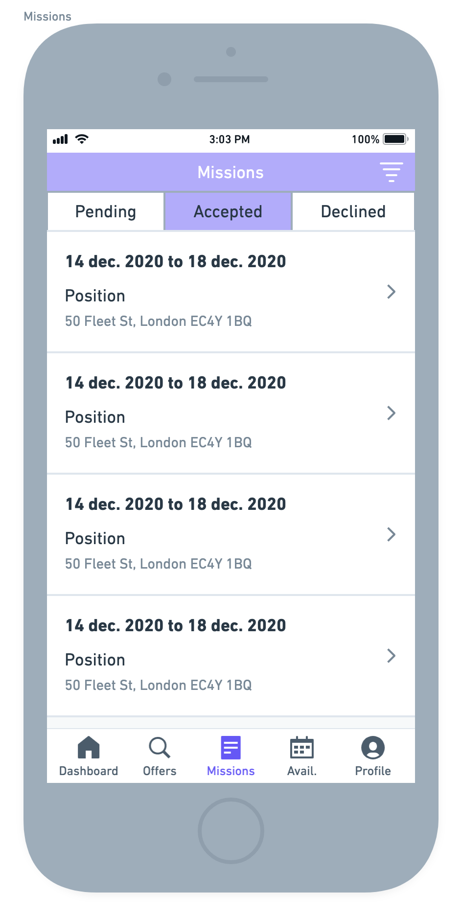
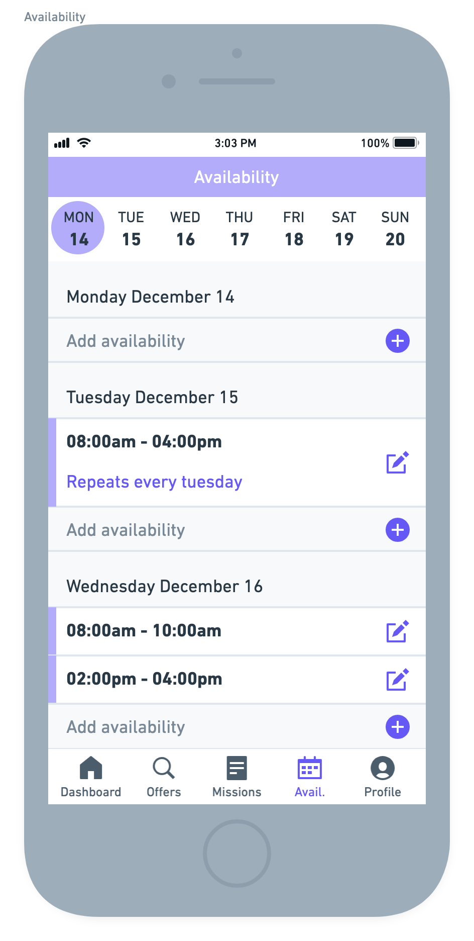
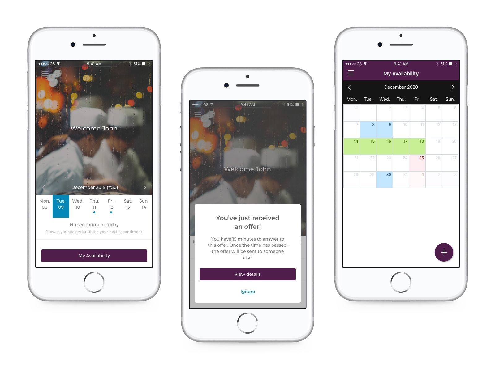
The idea was simple and consisted on two actions: employees should be able to apply to offers that fit their profile and they should be able to declare their availability.
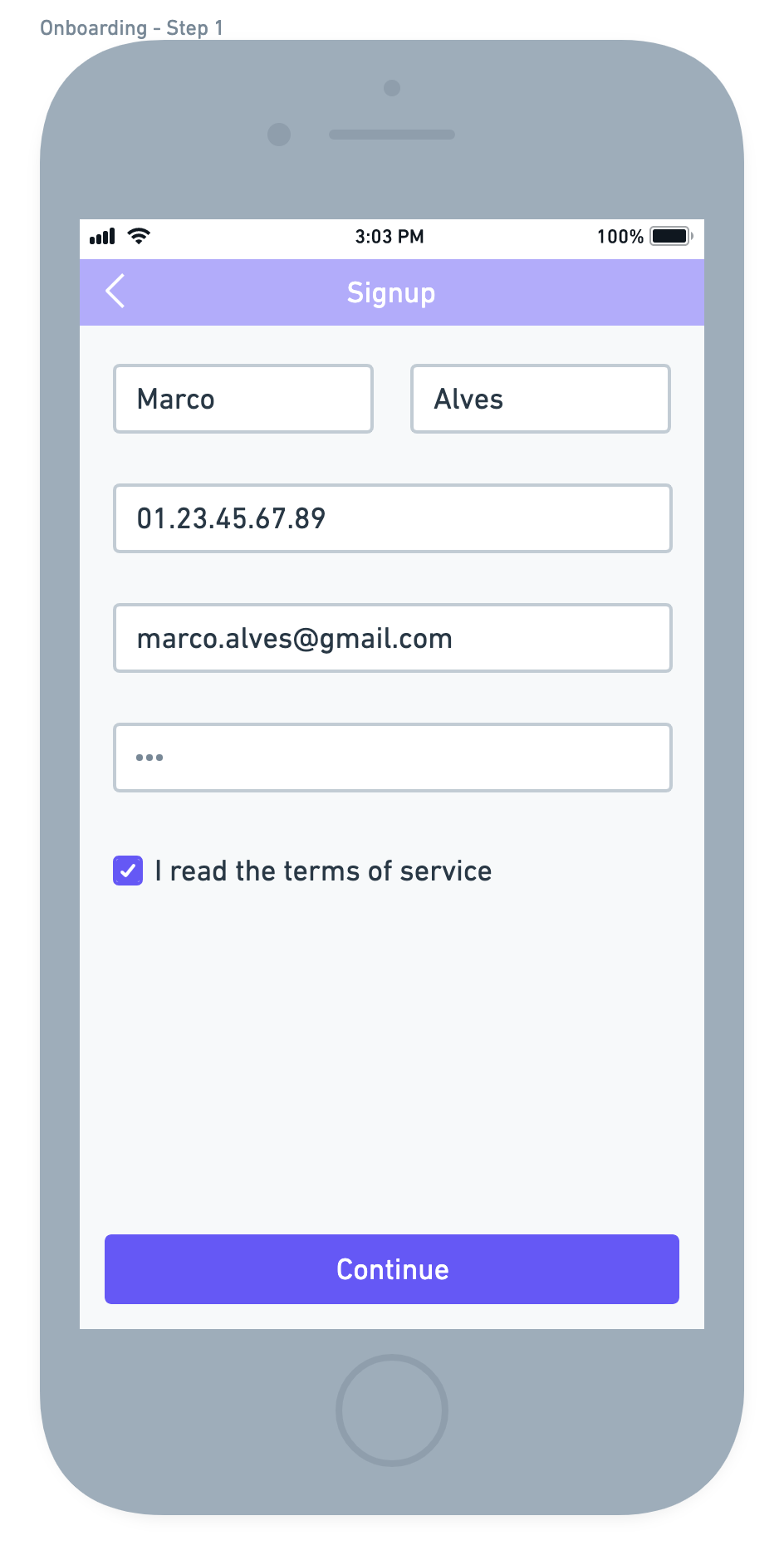
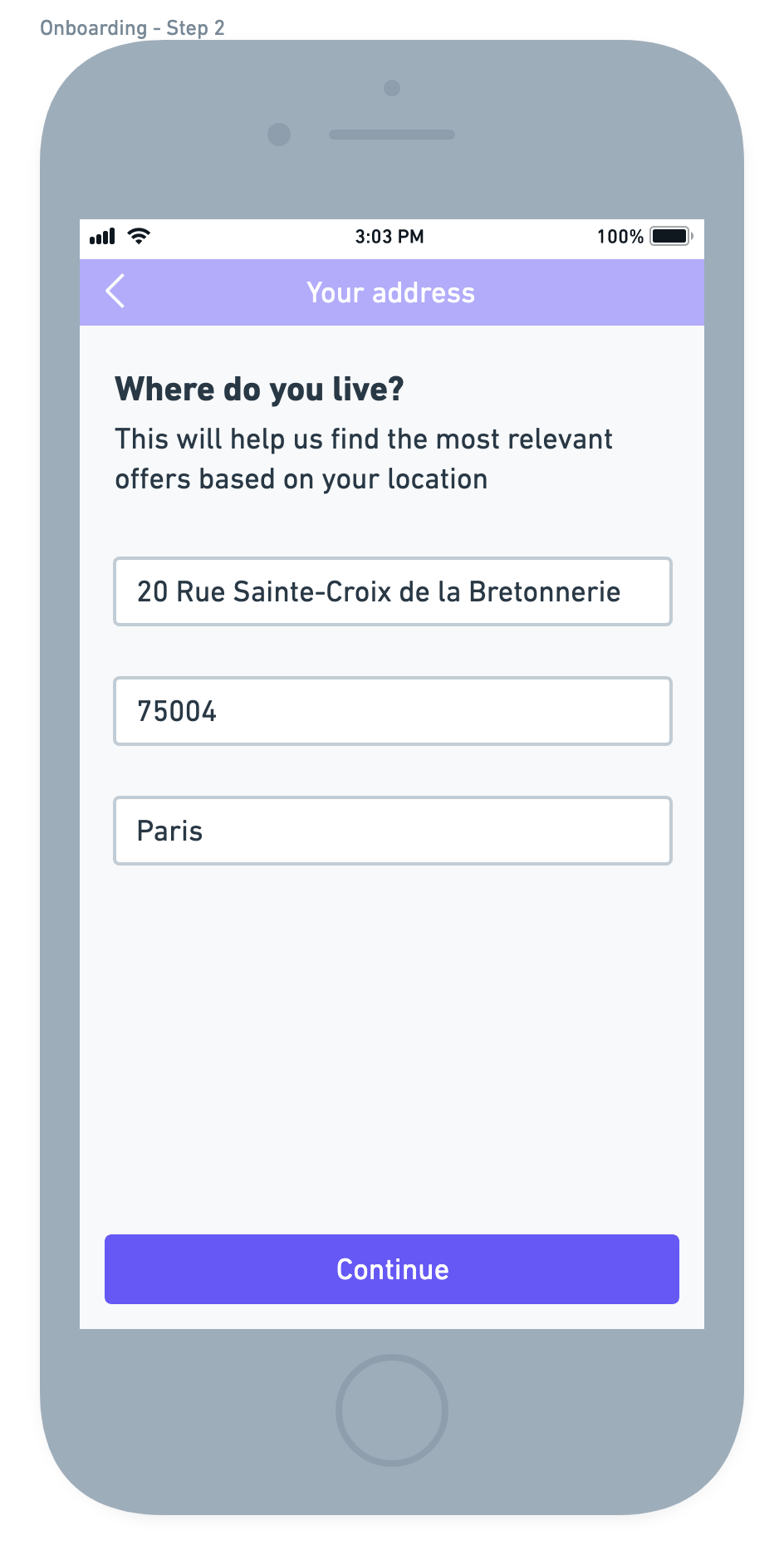
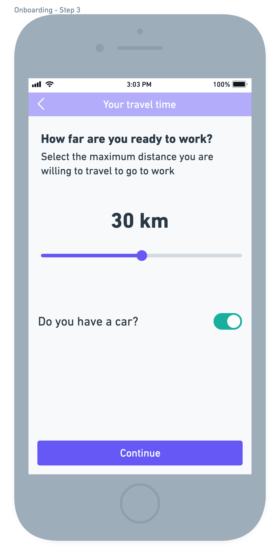
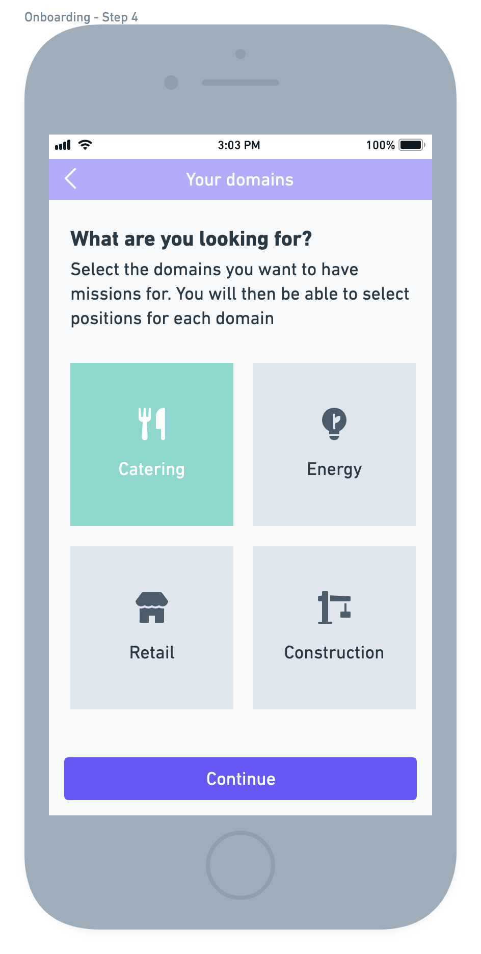
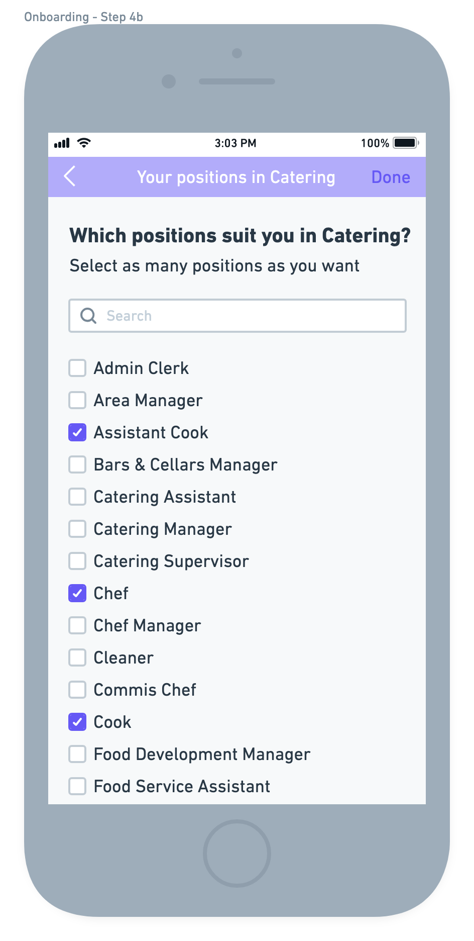
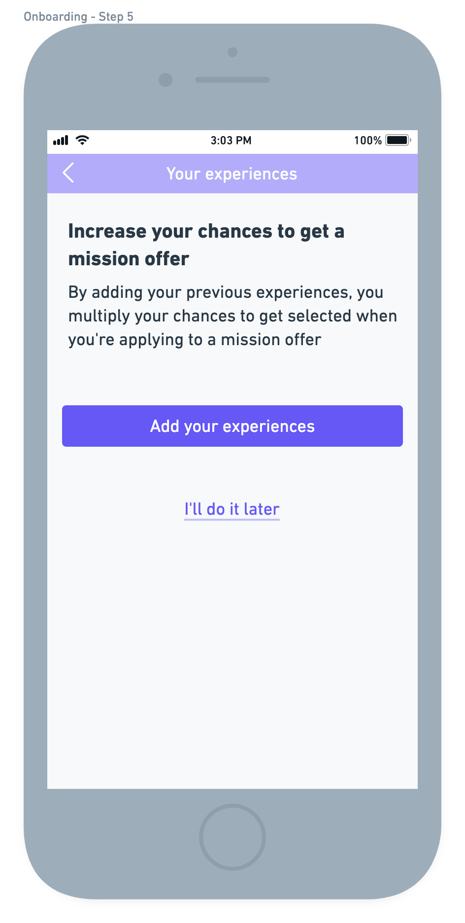
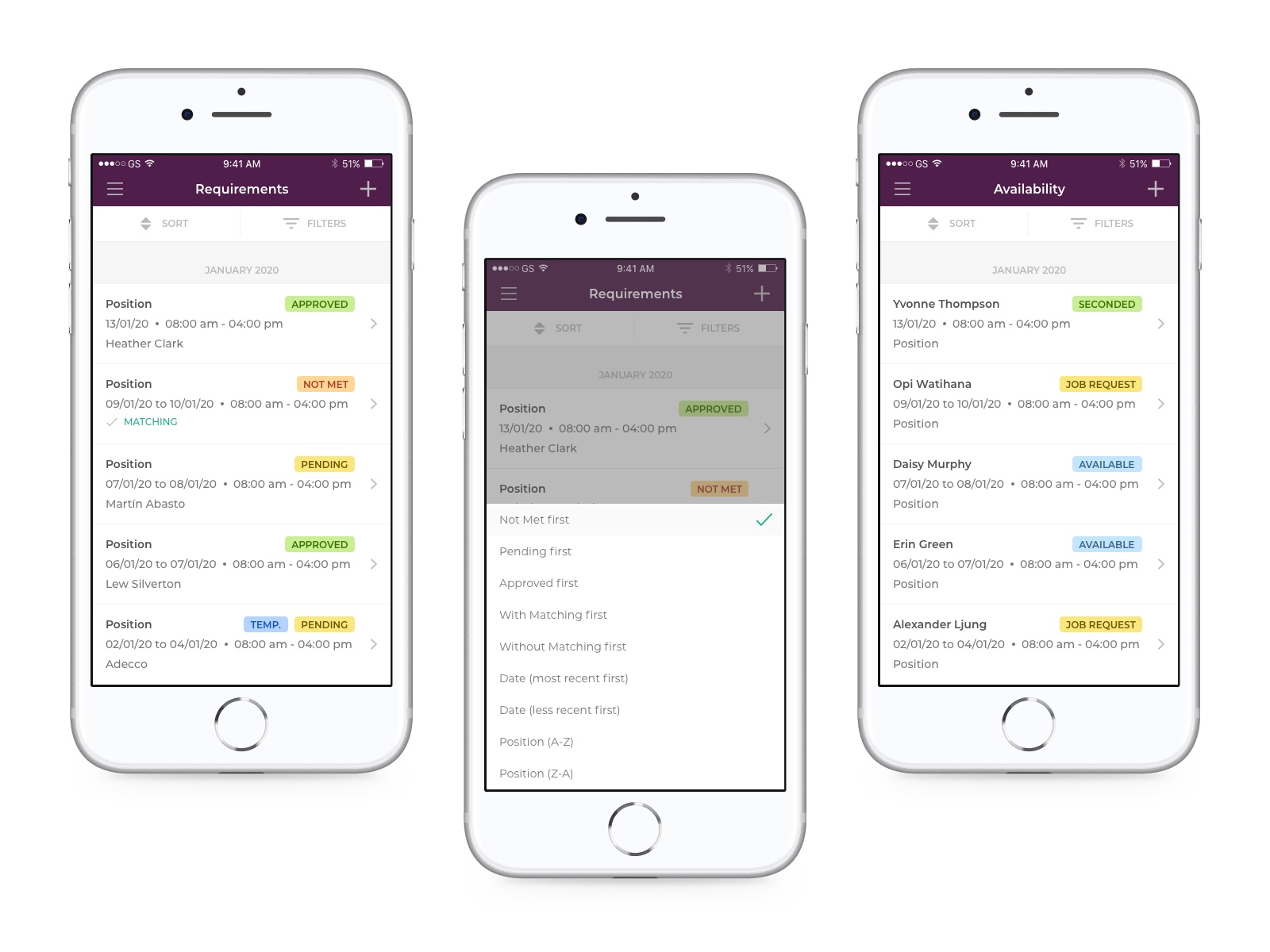
I first worked on the employee onboarding, which didn't exist at all. It allowed employees to start filling out their profile and to define what they are looking for. I splitted the sequence into several screens and small actions to give the impression that they are making good progress at each step. First, we asked them some general information, then little by little we dived into specific, like mileage, domains and position.
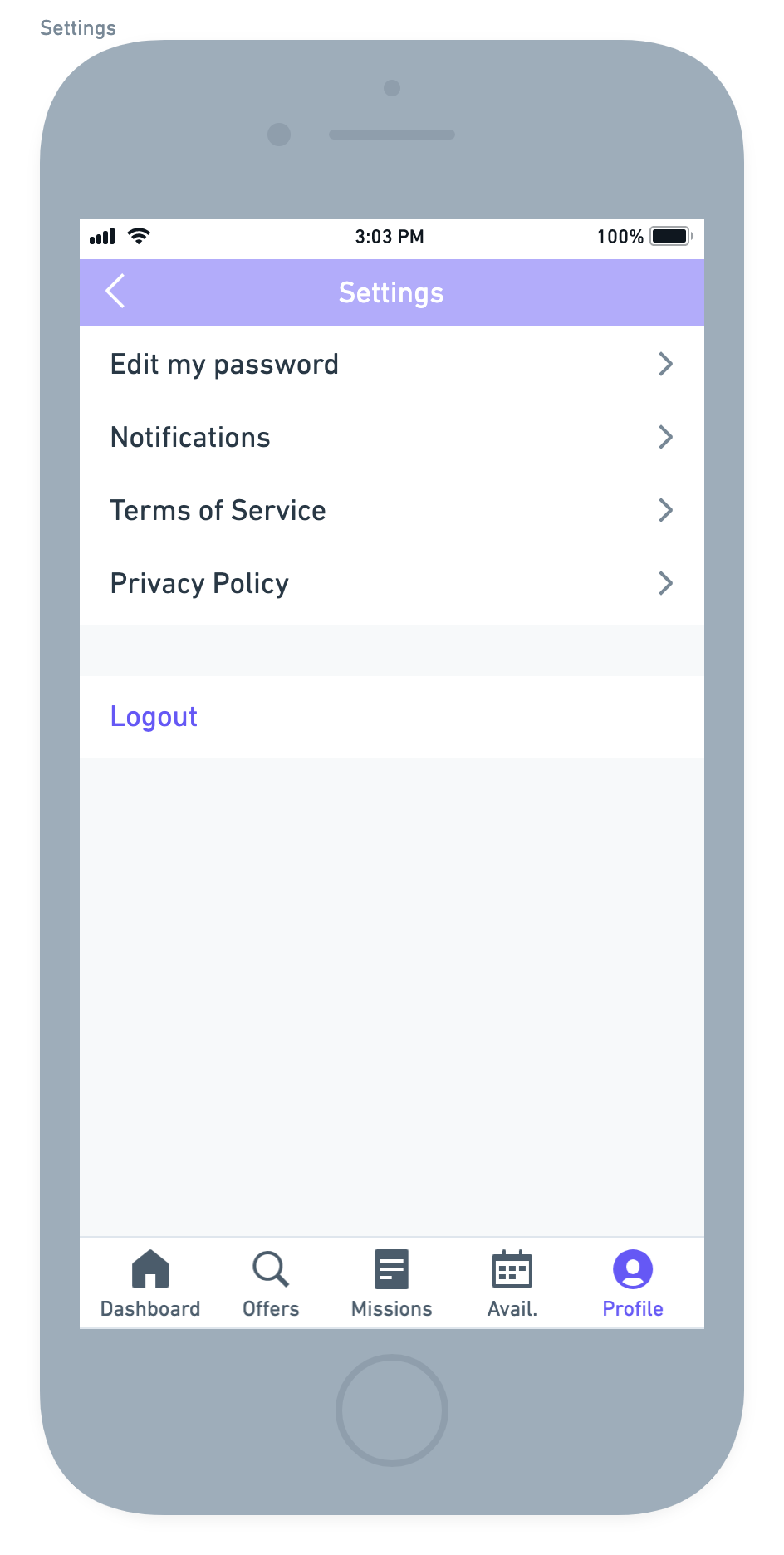
Then, I worked on the mobile application itself. What it should look like, what it should contain, do. I took up the original idea (apply to offers and declare availability), started to work on some wireframes and ended up with: a customized dashboard with overdue actions and missions, a missions' list with the ability to filter, see details and apply, a list of missions in progress, accepted, past to keep an history, the ability to declare availability and the ability to update profile and missions preferences.